Reconstructing (Portal 2)
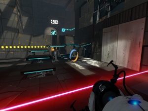
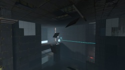
This Portal 2 aesthetic theme is displayed after the player had awakened GLaDOS in the single-player campaign. Because GLaDOS drops the player deeper into the facility, there is no presence of vegetation nor animals; however the facility is still in disrepair and like the earlier destroyed theme it is characterized by rusted, decayed areas filled with debris and broken glass.
This theme is also used in co-op Course 3.
Level transitions are usually placed in broken elevator rooms surrounded by malfunctioning screens and rubble. There might be objects flying through the elevator shaft prior to its arrival like cubes and turrets. These rooms become cleaner as the game progresses.
In-Depth
This theme takes all the good bits from the destroyed theme, and adds GLaDOS, everyone's favourite homicidal computer. So when making a map don't forget to get her talking. This theme is supposed to gradually get cleaner, this gives the impression the facility is back to its senses after a long sleep. The levels are very dynamic, plenty of panels are present, fixing walls, floors, and ceilings; they are used as test elements or just for decoration. And because of this theme's heavy use of entities that give the impression that everything is now alive, this theme is recommended for users with advanced knowledge of hammer.
Going by the campaign, Aerial Faith Plates, Thermal Discouragement Beams and Hard Light Surfaces are the main test elements used throughout the theme. However, that's a lot to go with, so don't try and cram everything in.
On another note, unlike the destroyed maps which are fairly small, this theme's maps are huge. In the game, there are large places to maneuver, and long Faith Plate jumps. The ceilings are high and large toxic pools are common. Some of these pools are up to 1024 units wide.
Noticeable Elements
The reconstructing theme theme is characterized by the very dynamic feel of it. GLaDOS is back in control and she needs to fix everything. Sometimes, she even builds the test chamber itself with you in it, adding the final touches.
GLaDOS
Yep, she's back, and if you're using this theme you want her in it. Seriously, a map without dialogue is twice as boring as one that has it. That said, however, go for the unique quotes; we've heard the 'here come the test results' line millions of times, but how often do you hear 'like an eagle, piloting a blimp'? Even better, go for some of the cut lines that can still be found in the game's files! For a list of GLaDOS lines, see this.
Lighting
In this theme, sky lighting is significantly diminished, and observation rooms are turning on as GLaDOS regains control of the facility. Some of these observation rooms have broken windows, but most of the windows are not broken. The most noticeable feature of the observation rooms in this theme is the initial flickering of the light as they turn on.
To create the lighting, add an off observation room instance, and then place a light or light_spot inside of it, and also an env_projectedtexture with the style set to 'Fluorescent flicker.' The angles of the light_spot and the env_projectedtexture should be the same, and should shine down on the main part of your test chamber. It's never good practice to have observation rooms at ground level.
Next, add a trigger_once in front of the test chamber entryway and connect it to a relay with the following outputs:
My Output > Target Entity Target Input Parameter Delay Only Once 
OnTrigger env_projectedtexture TurnOn 0.00 No 
OnTrigger env_projectedtexture SetLightStyle Normal 1.00 No
If you want the sounds to match, add an ambient_generic with the sound name set to VFX.LightFlicker and name it light_flicker_snd. Then add another ambient_generic with the sound name set to VFX.LightFlickerEnd and name it light_flicker_end_snd. Then add a third ambient_generic with the sound name set to World.LightFlickerPowerOn and name it light_poweron_snd.
Next, add a relay with these outputs:
To make this work, connect the trigger_once to this logic_relay.
Light strips are also common in this theme, and some of them have a buzzing sound. The sound should be added in the soundscape and not an ambient_generic.
Panels
Panels are present all around this theme, doing miscellaneous work other than forming the test chamber itself. There are literally hundreds of animations to pick and use from; and if that isn't enough, there are plenty of panel models to use, each with tens of different animations.
These wake animations are specifically tailored for this point in the game, and really give the sense that the facility is coming back to its senses. A good thing to do is scrolling through all the animations, with time you'll know exactly what you are looking for. You can find a full tutorial on creating these powerup panels on the full Panels page. Malfunctioning panels are still present in this theme, but they are a lot less common.
A thing that is important to point out is that on a large-ish grid size, the panels will be recessed two units into the wall; This is normal. A common mistake is moving them so they are flush with the Walls, and then adding the brush. All this means is that the panel will actually stick out from the wall. On that note, the brush attached to the robotic arm should be 2 units thick.
Now about those miscellaneous dynamic elements to cover; let's begin with the elements relevant to this theme. One clever little trick is using a trigger_look to trigger a relay, either when the player looks at it or when a certain amount of time has passed. This relay should start the animation of a panel or a group of panels. You should use it for the player might not look where you intended him to look and he'll miss all your hard work making those panels.
But panels aren't always attached to robotic arms; some panels are just a brush. This is brilliant for making panels fall of the ceiling into toxic slime pools, which is good for two things. First, it looks awesome, and adds a dynamic element to your map. Second, however, it can be used in a large chamber to draw the players gaze and attention to a certain area, one that they might not have otherwise noticed straight away, perhaps giving them some guidance on where to go, so they can begin with a goal. To do this follow these instructions:
Step 1
Create a func_physbox, and texture it as you would to any other rusted panel, useful textures for that are:
- black_wall_metal_005@
- white_wall_tile_004@
- squarebeams_rusty_01
@ - a variable, a set of letters and numbers.
Ensure the Motion Disabled flag is checked. Attach this func_physbox to a phys_hinge for maximum effect.
Step 2
Add a relay with the following outputs:
My Output > Target Entity Target Input Parameter Delay Only Once 
OnTrigger func_physbox EnableMotion 0.00 No 
OnTrigger phys_hinge Break 2.50 No
Then simply trigger the relay (an aforementioned trigger_look works well for this) and enjoy your falling panels! Don't forget to add some details to the BTS area behind the panel (squarebeams, etc).
However, you don't have to constrain yourself only to the ceiling. One can also perform this trick with wall panels; just don't use a hinge, but use a small phys_explosion behind the panel to knock it off the wall about a tenth of a second after its motion is enabled. There are instances you can use if you find them appealing:
- animated_panels\128x128_ceiling_panel_fall_01.vmf
- animated_panels\128x128_ceiling_panel_fall_02.vmf
- animated_panels\128x128_wall_panel_fall_01.vmf
Miscellaneous tips
These are the main elements that should be used through out this theme:
- Broken wall, floor, and ceiling pieces showing the square beam structure
- Falling wall and ceiling tiles, usually into gigantic pools of Slime Water
- Panels with power up animations
- Observation room(s) with an intially flickering light
- Active Security camera
- Enormous test chambers
- Flashing test sign
The geometry should be a lot cleaner than in the previous theme; everything should be a bit blockier, and more of the panels are black, also; though there are roughly the same amount of white tiles, the solution shouldn't be obvious. This is really what, visually, distinguishes the previous theme from this one. Don't hesitate to make whole walls white, just so long as black and white are in about equal proportion. If you want, add subtle visual indicators to where portals should be placed.
See also
- Panels - For more information on creating panels
- Making GLaDOS speak - A tutorial on making GLaDOS talk in a test
- http://theportalwiki.com/wiki/GLaDOS_voice_lines - GLaDOS voice lines, a great page with all her speech files

