Underground (Portal 2)
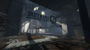
This Portal 2 aesthetic theme is shown in the old, condemned Aperture shafts, miles below the newer parts of Aperture Laboratories. It is characterized by darkness, decay, and simple practicality. Chambers are built with unfinished plywood and metal scaffolding. The giant background is composed of excavated bedrock, concrete, and enrichment spheres. Soundscapes include rock sounds outside of the enrichment spheres, water sounds inside the enrichment spheres, and the sound ambient\wind\underground_wind_lp_01.wav (a low, windy sound) is used more than in any other theme, especially outside of the enrichment spheres. The soundscapes are not very industrial-sounding.
This theme is also used in co-op course 5.
Level transitions take place in metal frame elevators between enrichment spheres.
In-Depth
This theme features a complete change in the environment. Outside of the enrichment spheres, it is a cold and dark place, with mold, metal garbage, debris, water, and broken walls forming the terrain. Each test is contained inside a huge enrichment sphere and pre-recorded messages are played in the testing environments to comment on the player's doings. Not everything in Old Aperture is contained within these spheres, however all tests are. It is important you remember that the people who operated these parts are long gone or dead. This means no one is maintaining the already unstable structures, and thus the buildings seem severely decayed.
Aperture Laboratories started building their facility from a deep salt-mine up. In layman's terms, the more you elevate the further you travel in time seeing newer devices and how Aperture had come to be. As the player advances through each test chamber, the tests become more destroyed; characterized by the broken spheres' shell and destroyed buildings within the spheres.
The most obvious test element to use in this theme are gels, and that's the only testing element you'll see in the single player official campaign besides cubes and buttons. However, gels being awesome isn't the only way to keep your test subject amazed; try finding more test elements to use. For example, in the Mobility Gels co-op course GLaDOS helps the bots solve the tests by inserting newer test elements, via robotic arms, into the testing spheres. It is important to make it obvious these test elements were not present in the initial construction of your test and is merely a device to enhance the testing experience. However, you can add test elements who seem to be early prototypes of test elements featured in the newer parts of the facility. These can and should be very simply constructed; good examples would be Aerial Faith Plates, rotating surfaces, etc.
Also, due to the enormous size of the Enrichment Spheres, combined with the interesting momentum dynamics the gels add, this theme is great for making momentum puzzles; if you've got wasted space at the end of your map, add a giant gel fling ending at the elevator.
Noticable Elements
Cables
Miscellaneous dynamic elements makes these tests feel more unstable. First off, we have cables; though they don't sound like much, these can sway and bob, especially if there's a shake or if they're attached at one end to a moving object. These do have a reason for being there; as power cables and ropes.
You can use cables and ropes in much more elaborate ways than just aesthetically pleasing, sometimes you want them to serve a purpose - like holding things up. In the level in the campaign where you had to paint the box to break the glass cage it was in, the cage was suspended by cables.
Step 1
First, create your cage in mid-air out of brushes. Now, tie them all to a func_physbox. You may wish to mess around with the settings so as to make it consistent. Name the physbox physbox_01. Now, add any other entities to be part of the cage, such as window frames, and parent them to the physbox. Now, set up the cables, going upwards from the cage. Parent the move_ropes to the physbox also. Now, we're going to add an entity that will actually constrain the cage by the ropes; meet your new buddy, phys_lengthconstraint. Create one at the origin of each move_rope, and set all their key values as follows:
Property Name Value Additional Length 32 Attached object 2 point <the origin of the corresponding keyframe_rope>Entity 1 physbox_01 Entity 2 <Name of corresponding move_rope>Constraint system manager rope_constraint Force Limit to Break 0 Torque Limit to Break 0 Name <A distinct name to be matched with each move_rope>
Leave all other key values as they are.
Step 2
Now, create a phys_constraintsystem and call it rope_constraint. This ensures that there is no unexplainable jiggling. Now, compile and you're done! Portal above the cage and stand on it, or push against it on the floor, and you'll see that it moves.
Structures
Main article: Underground Testing Tracks
If you use many different wall materials, it gives the impression that the builders of these sets were using whatever they could get their hands on: wood, metal, grating, sometimes nothing. Again, we see the left over paint work, which could have been used to tell the builders where to orient the test structure and is now left to hint the player.
Use plywood for the floor and walls, wood for the limited portable surfaces in the map. Use different metal textures on the same wall, use the models\props_underground\frame_128.mdl prop for unfinished walls, and often not adding a roof to your building is aesthetically pleasing too.
Miscellaneous tips
Remember these parts are the past of Aperture Laboratories, so there are no high-tech testing elements. Instead there are numerous props made by Valve specifically for this part of the game; filter them in the model browser by simply typing: underground. These are the main elements that should be used through out this theme:
- An Enrichment sphere containing your tests
- Underground elevators, for arrival and departure
- Concrete walls and cavernous environments outside of the enrichment spheres
- Plywood and greenish metal walls inside the enrichment spheres
- Various graffiti markings and information posters
- Offices with very outdated equipment
- Sliding doors
- Metal beams and trusses
Although there are no significant changes between the three eras of Aperture Laboratories you visit, there are some minor differences that should be taken into account when detailing. You may not have noticed at first, but the rooms progressively become smaller but longer to solve. This signifies Aperture's ability to create better tests, but it also shows the descent of their budget.
First decide when you want your test to be and follow this basic guidelines:
1950s
- Big, might contain 2 test chambers in one sphere
- Repulsion Gel
- Water
- Old-style catwalks as a transition to the next test chamber
- Portal surfaces are usually put only in necessary places
- Direct lighing
- Fully constructed enrichment spheres
- Bright colors, like yellow
Offices are rich with numerous props, red carpets, comfortable sitting chairs, carved wooden walls and chandeliers hanging from the ceiling.
1970s
- Big
- Propusion Gel
- Repulsion Gel
- Mold on walls
- Gel pipes
- Walls fell off
- Somewhat bleak colors, like blue and green
Offices are more of a waiting line for the hundreds of stick-gathering hobos that arrive. Advertisements promising $60 can be seen with some posters reminding people to not touch the glass.
1980s
- Conversion Gel
- Repulsion Gel
- Propusion Gel
- Gel Pipes leaking
- Enrichment Sphere is damaged
- Walls fell off
- Strong bleak colors, like gray
The offices look a lot more modern, almost like in the upper parts of the facility. Aperture is going through significant changes, and some of the workers are now robots in an attempt to phase out human testing. So there should be less cubicles then before and maybe add some side rooms with tables where employees built the robots.
See also
- http://forums.thinking.withportals.com/downloads.php?view=detail&df_id=464 - Old Aperture style Aerial Faith Plates

