Art Therapy (Portal 2)
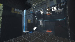
This theme is seen only in the 'Peer Review' co-op DLC. It appears to be set after Old Aperture, but before the modern facility. Tests take place in large, open areas, which are almost like resevoirs. The test chamber itself is unfinished, and there are many gaps in the roof and walls. This is not to be confused with it being 'destroyed' - it's simply unfinished.
Arrival and departure elevators are connected to the test chamber by catwalks.
Testing Elements
Because this theme appears to take place just after the Old Aperture area, gels are used in almost every test. Toxic water is the main hazard, however it can be a bottomless pit, with cliff faces around the sides.
Excursion funnels, hard-light bridges and lasers are also used often, but most elements work in this theme.
Noticeable elements
'Resevoir' area
Like mentioned above, the tests take place in a large open area, which is visible in transitions as well as at certain points in the test chamber. This area has to be larger than the test area, obviously, but usually isn't very full, aside from occasional gantries on the walls, and long metal beams going from side to side. There are also some large overlays of random 3-digit numbers. The chamber, as well as some elements, is supported by trusses, scaffolding, square beams and cables.
In the official maps, the walls of the resevoir area are textured with the props/plasticwall002 or 003 texture, with the texture scale at 0.50 (it is 0.25 by default). The floor is sometimes solid, but can be goo as well. If you use goo as a floor, you may want to add a 'tideline' overlay on the surrounding walls (if the player can see them).
Test chamber visual style
Throughout the test chamber, there are missing wall panels, sometimes exposing the 'anim_wp/backpanel' or 'props/plasticwall_002' textures, sometimes giving the player a glimpse into the area beyond. But remember - this isn't a destroyed theme! These gaps are sealed off by squarebeams and grating.
The roof is usually missing entirely, exposing hanging cables, square beams, trusses, and long metal beams. The floor is mostly pristine, however sometimes there's missing segments, exposing 'anim_wp/backpanel' textures. Sometimes, the floor is grating on top a squarebeam grid, supported by scaffolding.
Panels are used occasionally for things like staircases or barriers, but not often other than that.
Lighting
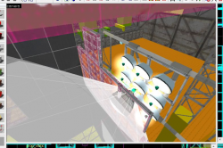
Due to the nature of this theme, you'll be hard pressed to find a good place for observation rooms, the usual light source. Instead, lighting comes either through the roof, or through gaps in the walls , by means of the 'stadium lights' seen in Old Aperture. These are supported by trusses and square beams, and have a single 'light_spot' about 16 units in front of the model, and an 'env_sprite' in the center of each of the model's 9 light fixtures.
The settings for the light_spot are usually:
Property Name Value Brightness 255 255 255 1500 Outer (fading) angle -60
The settings for the 9 env_sprites are:
Property Name Value Render Mode Additive FX Color 247 228 170 Sprite Name sprites/glow04.vmt Scale 0.9 Size of Glow Proxy 4
Placing an env_projectedtexture behind the square beams near the roof casts some epic shadows across your chamber - in fact, ALL of the official maps use a projected texture coming from the roof.
Ambient Lighting
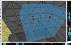
Because the BTS area of the map will be very dark without light sources, the official maps also put groups of standard 'light' entities near each top corner of the resevoir area, with the following settings:
Property Name Value Brightness 120 140 160 15 Constant 1000000002
There are 9 of them in a 128x128x128 box (4 at the front, 4 at the back and 1 in the middle).
Miscellaneous tips
The elements that should be used throughout this theme are:
- Missing wall, floor and roof tiles exposing the resevoir area
- Large pools of slime water
- Clean Aperture textures
- Elevators connected to the chamber by catwalks
- Grey/Blue fog
- Cool Lighting
- Primarily gels, but any of the testing elements
See also
It is recommended to look at the official maps to see exactly how this style is executed.
In alphabetical order, the maps in the coop campaign that use this style are:
- mp_coop_2paints_1bridge
- mp_coop_bridge_catch
- mp_coop_catapult_catch
- mp_coop_laser_tbeam
- mp_coop_paint_conversion
- mp_coop_paint_crazy_box
- mp_coop_paint_rat_maze
- mp_coop_separation_1
- mp_coop_tripleaxis


