Underground Testing Tracks (Portal 2)
![]() This Portal 2 tutorial will expand on the Old Aperture page with various insightful tips and tricks too complex or long for the main article to contain.
This Portal 2 tutorial will expand on the Old Aperture page with various insightful tips and tricks too complex or long for the main article to contain.
In-Depth
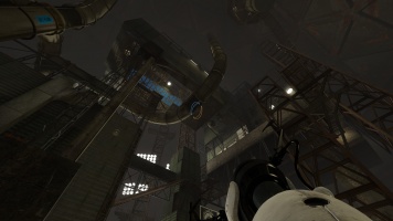
Aperture Laboratories again proves they are able to find the most ridiculous ways of dealing with their issues as a growing facility. This time they bought a salt-mine and started building from the bottom upwards. Now they faced a new problem - how to build their testing tracks. Luckily they found a solution for that too, they built huge metal spheres that suspend hundreds of feet in these underground trenches. So a major component when designing an Old Aperture-themed map is capitalizing on the exterior portions of your map. The enrichment spheres are meant to give an ominous impression, full of damaged structures and deteriorated walkways. A successful Old Aperture map looks daunting – although it has survived the test of time, it has received scars and has potential for danger.
The map is almost completely revealed at the start of the course, exposing all of the brittle supports and winding pipes. However, the feeling of anticipation is built as the player wonders what incredible events occur in the upcoming structures. Valve’s maps are designed like soundstages on a Hollywood movie lot to detach the player from the realities of Chell’s dire situation and enter the world of Aperture Science in its 1950’s heyday.
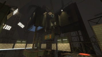
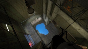
By raising the next chamber up, you're giving the building a dominating presence in the map – this is a place that the player will ultimately have to make his climb to the exit. No matter what kind of map you are working on, designing it with a vertical perspective is a good idea as it makes gravity its own puzzle element and gives the player the sense of progress. It is also crucial to remind the player, when in Old Aperture setting, the player is deep underground and wants to reach the upper parts of Aperture - so the player should find the exit near the upper parts of the sphere. I’d also like to take the time to note how important lighting is in Old Aperture maps. Unlike its clean counterpart, Old Aperture should have plenty of variance between dark and light to display the importance of certain areas and elements. There’s a lot of extra space in the spheres, so designers need to use light to show where the player should and shouldn’t need to go.
Since much of the exterior work is built to make the player anticipate the upcoming chambers (unless you specifically designed a puzzle to work outdoors in Old Aperture, which has its own upsides and downsides), making the interiors is equally important.
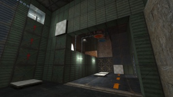
The important element in this map, and throughout the Old Aperture section of the game, is the function over cosmetic point of view. These “sets” aren’t designed to impress people with their state-of-art architecture or beautiful design, but rather to supply as a testing stage that can be easily built. From this picture alone, we can see the bare bones of the structure are visible: the building’s framework lining the ceiling, the air conditioning system riding up the wall, metal and wood supports holding up corners and edges and left-over paint work.
If you use many different wall materials, it gives the impression that the builders of these sets were using whatever they could get their hands on: wood, metal, grating, sometimes nothing. Again, we see the left over paint work, which could have been used to tell the builders where to orient the test structure and is now left to hint the player. For the inside of the structure, I used a mixture of self-designed florescent lighting along with the “cold” light instances to give the section a more isolated, forgotten feeling in comparison’s to the exterior’s warmer, ominous glow. Again, it is important to highlight the pinnacle testing items.


