SteamVR/Environments/Environment Tutorial: Materials, Details and Props
Continuing this series on the creation of a SteamVR Home environment (see the previous part for an introduction to Hammer and basic lighting), we now get to creating and using some materials.
Materials
What are materials, anyway? VMAT files are descriptions of how surfaces should look in the engine, be they on Hammer geometry or on a prop. They're often a collection of different textures - 2D images which describe various visual aspects of that surface, such as colour, its reflectivity and so on. In the past, the word 'texture' was often synonymous with 'material' - rendering systems for 3D games being much simpler than they are now.
We'll go into some of this added complexity later, but for now we'll start with the basics.
Creating a Material
In the Asset Browser, click the shiny ball icon on the toolbar to open the Material Editor. This will bring up a mostly empty window. Go to File : New to create a new material.
To make this material usable or changeable in any way, you'll need to save it. So now, some notes on naming materials!
All content for your addon, be it source content or compiled, lives somewhere deep inside your Steam folder. There's more information on addons and content elsewhere on this Wiki, but it'll be somewhere like Steam/steamapps/common/SteamVR/tools/steamvr_environments. Materials themselves live in imaginatively named materials folders, with a little extra hierarchy depending on what they are.
content/your_addon_name/materials/models/model_name- materials for props (also referred to as models) go somewhere like this. If you're using the FBX or OBJ importer, things will automatically get placed in folders like this.content/your_addon_name/materials/material_type- materials for Hammer geometry typically get placed in folders describing their type. 'concrete', 'glass' andwood' are good examples. These names have no specific meaning to the engine and tools, and are there solely as a convenience to the user - you can name things however you like.
We're going to start with making the walls of our recreated room look a little more realistic, so our material will be 'materials/plaster/plaster_rough001.vmat' - it's for use on Hammer geometry, so we've saved it in a subfolder of 'materials'.
Blank material editor, waiting for something to happen.
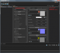
New material - need to save it to make changes!
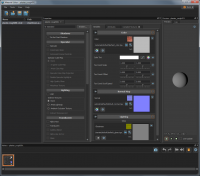
Material saved and ready for action.


Now we have a flat grey material. That wasn't much of an improvement, was it? We need to add a texture to it.
Textures
Textures are those 2D images that the material files will generally refer to - defining more complex visual aspects of that surface.
Dimensions and File Formats
Game textures almost always have powers-of-two dimensions, for various technical reasons - sizes you might typically use are 128, 256, 512, 1024, 2048, 4096 or even 8192. Textures can be non-square - a 512x2048 texture is just fine.
Here are some accepted source texture file formats:
- TGA - Truevision TARGA, a very basic format that has stuck around in the games industry both for its early support for 24-bit colour and for its simplicity in implementation. Minimal or no compression, so it's fast - but may take a lot of space in your content folder. If your image editing software doesn't support this, you should probably use something else.
- PSD - Adobe Photoshop Document, the native format for Photoshop. Potentially very large on disk due to the presence of layers and other complexity, the use of this is recommended for Photoshop users since the engine will automatically recompile content whenever the file is saved in Photoshop, which really helps speed iteration. If the original is a PSD, then it can be good to let the engine use that PSD directly. Keep things as 8 bits per channel RGB or Greyscale, then save with maximised file compatibility, and things should be good.
- PNG - Portable Network Graphics, a losslessly compressed, potentially 24-bit image format. Can take longer to save due to the compression, but saves space in your content folder. I'd mainly recommend it for use with photogrammetry environments involving many huge textures - the corresponding .TGAs would be huge.
- JPG - JPEG, a lossy compression format used more for photographic content. While it'll work, you'll get some (potentially minimal) quality loss. It'll save plenty of disk space on your machine, but isn't worth it for the following reasons...
Different source texture formats won't affect the compiled textures - a texture compiled from a source TGA will look identical, and be identical in size, to one compiled from a corresponding PSD or PNG. Use of different source formats is about convenience to you, the creator, rather than to end-users downloading the addon from the Workshop.
Textures will be compiled to a proprietary .vtex_c format - the only thing you really need to know about it is that it'll typically and automatically use the lossy DXT1 or DXT5 compression to save space on disk and in graphics card memory. There will be a minor decrease in visual quality, but textures end up using a fraction of the space they would normally.
Photo-sourced Textures


One method for obtaining realistic textures for building photo-realistic environments is to literally take photos of relevant surfaces. The resulting images are cropped, adjusted, mixed and edited in software such as Adobe Photoshop or The GIMP (the former is expensive, while the latter is free and open source). While a full guide to creating textures from photos would stretch to many, many more tutorials, some basic guidelines are as follows:
- Correct lens distortion and perspective - if your source photos involve straight lines, make sure to correct any lens distortion and chromatic aberration (Lightroom is excellent at this), and correct the perspective so that squares appear as squares. Both Photoshop and The GIMP have good tools for this.
- Remove superfluous lighting and unnecessary low-frequency variation - take your photos in flat, overcast lighting if at all possible, and remove any unwanted gradients and colour differences. One trick is to extract detail by using the High Pass filter, then Overlay that layer over a flat-coloured background. Inverting the colours of a heavily blurred copy and then Overlaying that over the unblurred original is another trick.
- Make the texture tileable where necessary - the Offset filter is good for offsetting the texture by a particular amount, moving the edges to the centre so that you can clone out discontinuities.
- Don't be afraid to combine different sources - you might have some particularly good rust from an entirely different location, or some concrete cracks or chips which would look just right. There are libraries of free texture source photos online - go use them!
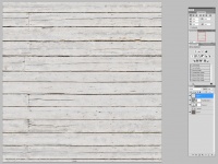
My initial 'rough plaster' texture is the surface colour (or albedo) for the material - I sourced it from bits of plasterboard, a building frontage in Seattle and even a wall in a sister's house that had just had ancient wallpaper removed. I've saved it alongside the VMAT as 'materials/plaster/plaster_rough001_color.psd' - note the use of '_color' in the filename, which defines what it's being used for.
To tell the material to use this new texture for its colour, click the little folder icon to the right of the default filename then select the appropriate texture file.
_color' at the end of the filenames - the reason for this will become clear as you build up textures for different uses.For convenience, we'll specify a particular in-world width and height for this material - this means we can use consistent scale factors for textures of different sizes. In the Attributes tab for the material, enable Set World Mapping and set both the World Width and World Height to 128 game units (this being a square texture). This tells Hammer that by default, the material will be 128 game units wide and high when scaled to 0.25 - this is an old scaling convention inherited from Half-Life 2 of all places. (The original Half-Life would have a 128x128 texture at 1:1 texel - texture element, basically pixel - to game unit scaling. Oh, how graphics technology advances - our new texture is 4096 texels square...)
We now have a material with a texture for its colour. Let's see how it looks on the walls!
Using the Material


Back to Hammer again, and the map we've been working on.
In Faces selection mode, Shift-Right-click on a wall to set the Active Material to that material. Remember how we went to the effort of changing the walls and ceiling to use a particular placeholder material? There's a simple way of selecting all those faces - click on Find / Replace Textures, then click on Mark to set all faces using the active material to selected. Now, under the Active Material to the bottom left, click Browse - in the material browser, scroll to your new material, or type in part of its name in the Name Filter box to speed things up. Double-click the appropriate material to return to Hammer with it set as the active material.
Now, click Apply Current Material. This will set the currently selected faces to use the Active Material. Everything will be looking rather orange due to the faces still being selected, so it will be tricky to see the results - you can temporarily change to Objects selection mode then press Escape to deselect the mesh to get a full view of your new material in action.
Material Alignment
You'll likely want some control over how your material appears relative to the world - on where details in the texture will be positioned on the surfaces. This is done with the Texture State and Modify Texture controls in the Tool Properties for the Faces selection mode. (The mention of 'texture' in the names is from that bygone age when materials were synonymous with textures...)
The Scale, Shift and Rotate numbers are some heavy-duty controls over the material's alignment - for simpler things, you're best off sticking with the Modify Texture controls. Some details on the different sections:
- Align - the first button in this section, Align to Grid is a great reset-to-defaults button. I'd recommend starting off by clicking this - it'll set the scale, positioning, rotation and projection to simple defaults.
- Scale - you can stretch or shrink the material horizontally or vertically using these buttons.
- Shift - for moving the alignment left or right, up or down.
- Rotate - spins the material around.
- Fit - these buttons change the scale and positioning so that a material fits in a particular face.
- Justify - these change the alignment so that the left, right, bottom or top of the material become flush with the appropriate edge of the selected face. If your material has a particular boundary in it, this is a good way of quickly setting the alignment.
The Treat as one checkbox below the Modify Texture controls makes Hammer consider multiple faces as one big face - this is really useful when dealing with more complex geometry. If you have multiple faces making up a wall, select all of them and features like Fit and Justify with treat the wall as one single face.
Another super-useful feature: with one face selected, Alt-Right-click an adjoining face to continue the material alignment on to that face. This works around corners, so is great for more complex alignments.
After a little bit of work on alignment (our rough plaster texture doesn't need particularly exact positioning or scale), we're ready to rebuild lighting and recompile the map to take a quick look at things in VR.
More Advanced Material Properties
The material we've just created is really quite basic from a visual standpoint. In the real world, it would be perfectly flat, and completely matt - with no shininess, reflectivity or variation on its surface other than colour. The good news is that we've got a really quite advanced physically based rendering system at our disposal in SteamVR Home - similar to many other modern game engines, albeit with a few quirks.
A really useful feature is that changes made in the Material Editor will automatically show themselves in Hammer and in VR, even without saving the material - this, combined with automatic recompilation of saved textures, allows for very rapid iteration. Want to tweak something and see how it looks? It's almost instantaneous.
For our plaster material, we want to enable some more advanced shader features ('shader' being the tiny computer program that runs on the graphics card, generating rendered pixels from texture values and other variables). Click on the Specular, In-game Cube Map and Specular Cube Map Projection checkboxes to enable the features we'll be using.
Colour
materialname_color.tgaor similar -.psd,.pngand so on are also accepted formats
We've already created one of these, but a few more notes on colour textures - they describe surface albedo, without any lighting applied. If you have any baked-in specularity or lighting in your colour textures, it probably shouldn't be there - which also applies to ambient occlusion bakes.
Normal Map

materialname_normal.tga
A normal map is a texture which describes surface contours without involving additional geometry - it allows lighting, reflections and similar to work as if the underlying mesh is considerably more detailed. It is used for simulating lumps, bumps, small surface details and subtle shapes that aren't easy to express with geometry alone.
Essentially a vector showing how the surface normal (a line sticking out perpendicular from the surface) should point relative to some lower-detail geometry, normal maps are often generated in 3D modelling software by comparing a high-detail mesh with a simpler one.
For our plaster material, I've used software to generate a normal map from a hand-authored heightmap - in my case I used Crazybump, although other software is most definitely available. (The Normal Map plugin in The GIMP can also work with heightmaps - greyscale images describing the height of a surface compared with a flat plane).
For VR and near-photorealism, it pays to be subtle - don't just throw a colour map into normal map generation software and hope for the best. Human eyes are much better at picking up slight variations on a surface when seen in VR than when seen on a flat monitor.
For us, the resulting filename is 'materials/plaster_rough001_normal.psd' - we set the material to use this as a normal map in a similar way to setting the colour map.
Reflectance
materialname_refl.tga
Reflectance is a texture (or single value) which describes the reflectivity of a surface, with zero being non-reflective while one being fully reflective. Higher values describe bare metal surfaces, metal covered in a transparent coating, or even metallic paint.
A material which should be completely metallic or non-metallic can have a single value specified for the reflectance - do this by clicking on the Change to Slider button. Change back to a texture with the Change to Texture button.
When working with a reflectance map, the Range sliders are useful for specifying a minimum (from black in the texture) to maximum (from white in the texture). This feature is very handy for making minor tweaks!
For our plaster wall, we're using a single reflectance value of 0.05 - this gives very slight reflections, helping things feel more present in the world. 0.05 is a good minimum for reflectance values, making things feel more grounded and physical.
For reflectance to be visualised properly, it's necessary to use a map with full lighting set up - using env_combined_light_probe_volume and similar. Hammer will render things correctly with All Lighting set for the 3D view - in the little pop-up menu to the top right. (This is likely to be set by default, but in case you've changed it...)
Gloss

materialname_gloss.tga
Gloss is a texture (or single value) describing the smoothness of a surface, with black (zero) being completely matt and white (one) being perfectly smooth. It controls the size of specular highlights (with matt surfaces having wide, dim highlights and glossy ones having tight, bright highlights) as well as how defined reflections are - a material with high reflectance and low gloss will look like a dull, clean metal with blurred reflections, while a material with high reflectance and high gloss will look more like chrome.
An material with low reflectance and high gloss will appear more like a snooker or billiard ball, while low reflectance and low gloss would be a dull concrete.
For our plaster, the hand-authored gloss map has values of around 0.6 (RGB 155, 155, 155 in Photoshop), with cracks and smears being a little darker.
Metalness
materialname_metal.tga
Metalness is a texture (or single value) describing by how much specular highlights, reflections and so on should take on the underlying colour of the surface. It's generally used in conjunction with reflectance, but useful for special effects - without reflectance, small but non-zero values for metalness can give the impression that light has sunk into the surface somewhat (useful for plastic, flesh and similar).
It is very important for coloured metal (gold, brass and others) and for reflective surfaces covered with transparent coloured material, such as anodised aluminium, Christmas baubles and similar. In these cases it can be a copy of the reflectance map with tweaks made to the range sliders as necessary - in many PBR-based renderers, 'metalness' is a combination of reflectance and this metalness.
Our plaster material is very unexciting and deeply non-metallic, so we're leaving metalness as a single value of zero.
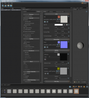
Our plaster material in the Material Editor.
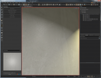
3D view in Hammer showing subtle specular highlights and surface detail.


Now we've more completely set up our material, we can rebuild lighting (again), recompile the map and see how it looks in VR. Subsequent tweaks changes to the material will automatically update in Hammer and in VR - the rebuild was mainly a precaution to make sure the addition of specularity and reflections would be fully recognised.
Multi-way Blends
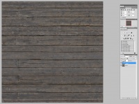
For the floor of our scruffy old apartment, we want to simulate some worn, painted wooden planks. We could author one big material for this, with the wear patterns contained within the textures, but instead we'll use the handy texture blending system. This will mean we have a more reusable material, with wear and tear being painted into the scene using Hammer itself!
The multi-way blend system uses vertices on meshes as points to blend between, with subdivided faces having many more vertices to work with. Since we're already using the subdivision feature for better indirect lighting, this is a double bonus - we can have those vertices doing even more work for us.
Material Setup
We'll create our colour, gloss and normal as usual:
Colour texture, saved as '
materials/wood/wooden_floor001_color.psd'.
Normal map, saved as '
materials/wood/wooden_floor001_normal.psd'.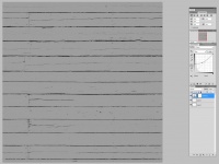
Gloss, saved as '
materials/wood/wooden_floor001_gloss.psd'.


First we set up the material, 'materials/wood/wooden_floor001.vmat' in a very similar manner to the plaster material described above - with Specular, In-game Cube Map and Specular Cube Map Projection all enabled, and a World Mapping also set to 128x128 game units. This will be the base, unpainted floor for our material.
Now we need two more textures - a colour map, and a reveal mask:
Painted wood colour texture, saved as '
materials/wood/wooden_floor002_color.psd'.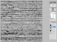
Blend reveal mask, saved as '
materials/wood/wooden_floor_001_002_blend.psd'.


Use of a blend reveal mask is optional - without it, the material will do simple linear blending between the two layers, but using it will allow much more naturalistic, organic transitions between layers. Black areas are revealed first, while white areas are revealed last - I made the reveal mask for this painted floor by messing around with high contrast on the underlying wood until I found something which worked well.
The two-way blend feature in the material is enabled by selecting 2-Layer under Blend - this will add a new section in the Variables tab, enticingly labelled Layer 1 (the first layer being layer zero). Set the Layer 1 Color to use the second, painted wood colour texture, and Layer 1 Reveal Mask to use the new reveal mask. Reflectance is also present - here I'm using a single value of 0.05, the same as for the base layer.
Save the material, and switch back to Hammer!
The Paint Tool

We can now change the floor to use our new wood material, and adjust the alignment, rotation and scale to taste. By default, the floor should initially look completely unpainted.
Switch to the Paint Tool with the paintbrush icon near the bottom of the toolbar to the left, then Shift-Right-click on the floor to begin painting. As standard, the brush will start off particularly wide and high-intensity - this can be adjusted in the 3D view by holding down the middle mouse button (cunningly disguised as a scroll wheel) and moving the mouse left and right to change the width of the brush, and up and down to change the intensity. The width is shown by a red circle around the centre point, and the intensity by a line sticking out.
To paint, left-click on the wooden floor. You should get the new layer blending in - to erase, hold down control while left-clicking.
After some careful work in making this floor look old and worn, we can once again save the map, rebuild the lighting and recompile it to see how things look in VR.
Adding Visual Detail
Hammer Geometry for Detailing

If you haven't already, read through the Hammer mesh editing tutorials. With the addition of a new, simple painted wood material, we can add skirting boards, crown mouldings and architraves - all those fiddly detailed bits around the edges. I built mine by making a cross-sectional profile as a single face, then extended its edges outwards with Shift-Translate - I then used the Clipping Tool to make 45-degree cuts before heading off in a new right-angled direction.
I also used the Hard/Soft/Default Normals feature in the Edges selection mode to make particular edges look hard or soft - vertex normals can be made to bend around edges, or not.
A simple fireplace was built using an existing, basic dark reflectivity material - I'll look at making it more detailed in a future tutorial.
Static Props

An important part of level design is in the placement of props, or models - these allow much more detailed (and reusable) sections of geometry than can be feasible to construct in Hammer alone. SteamVR Home includes a variety of furniture-related props - we're going to use some of these to add further detail to our rooms.
Toggle between the single-pane 3D view and a three-pane view with Shift-Z - by default, this will show an overhead 2D view an an Asset Browser in addition to a 3D view. Click the Models tab in the asset browser, then in Name Filter type in 'furniture'. The list will update to show thumbnails of the different furniture props available.
Scroll down to find the couch prop, then left-click and drag it into the 3D view. It's as easy as that - you can then temporarily hide the asset browser with Shift-Z, then use the translate tools to move, rotate and even scale the couch to how you want it.
prop_static to prop_destinations_physics.After a bit of work in arranging props around the rooms, we're pretty much done with this part of the tutorial. We've gone from some grey boxes to something much more resembling a real place. But we're still not done!
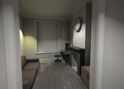
One view of the newly detailed rooms. (Screenshot taken inside Hammer - you can temporarily disable/enable the display of game-related objects by pressing Shift-O.)
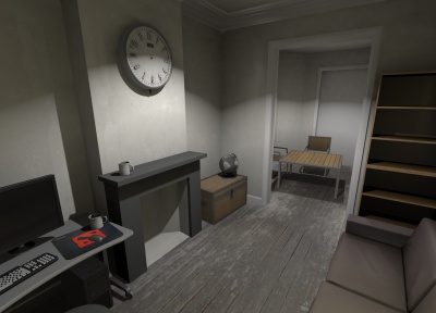
Another view of the newly detailed rooms.


Coming Next
In the next tutorial, we'll be covering creating new props, including physics collision hulls, ambient occlusion textures and physics sounds.