SteamVR/Environments/Environment Tutorial: Hammer and Basic Lighting
This series of tutorials will cover the construction of a SteamVR Home environment depicting a real place, starting with basics such as building the basic geometry, simple (but effective) lighting, and going all the way to making near-photorealistic materials and physics props. Hopefully there will be something for everyone along the way, from absolute beginners to seasoned game developers curious about the specifics of making things for SteamVR Home.
Creating an Addon
For SteamVR Home, an addon contains everything you might upload as a single item to the Workshop - a map, textures, materials, models, sounds and so on. Consider it as a little self-contained project - you can move files from one addon to another, but each one stands on its own. There's more about the concept of addons, and the content and game folders elsewhere on this Wiki.
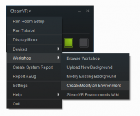
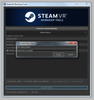
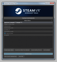
To create a new addon, start up SteamVR and, in the SteamVR menu, select Workshop : Create/Modify an Environment to start the SteamVR Home workshop tools. Once the addon selection window appears, click Create Empty Addon and enter a name for your new addon. (It's best to keep to lower-case letters and numbers, and underscores instead of spaces - it'll rename it if it doesn't match its exacting standards!) Then, once it creates the addon (it'll set up some basic folders and configuration files in content and game) it'll give you the opportunity to Launch Tools.
The Workshop Tools in Action
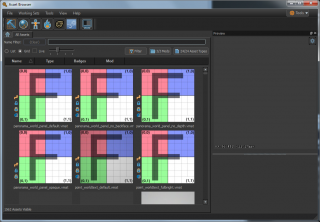
Once you've launched the tools themselves, there'll be two windows present - the square SteamVR Home window, which will likely be showing a Valve logo (it'll act as a mirror window for VR when you have a map running), and the Asset Browser. The latter is the main hub for launching the individual tools available - such as Hammer (the map editor) and the imaginatively-named Material Editor, Model Editor and so on - as well as acting as a central browser for the assets available in your addon.
There's a general breakdown of different asset types elsewhere on the Wiki.
By default the Asset Browser will be showing various tools materials - we can ignore these for now. Instead, let's build a map! Click the 'Hammer' icon to the top left of the Asset Browser window.
Hammer
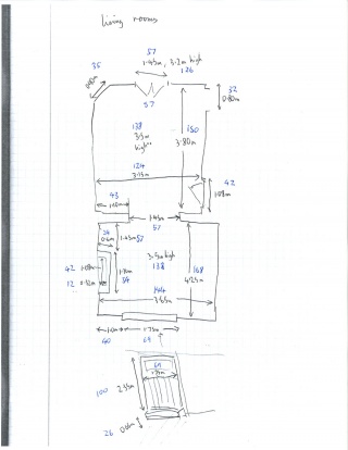
Years before I figured out that whole photogrammetry thing, I lived in yet another foreign country - in a somewhat crumbling town-house apartment. I was doing game level design work for a hobby, and for some reason lost to the mists of time I decided to get out a tape measure and get full measurements of a fair section of the apartment I was living in. (If only to demonstrate its ridiculously high ceilings...) I still have those measurements, so using the magic of Virtual Reality, we'll be revisiting this place I left quite some years ago.
This should also apply if you make measurements of your own home - giving you the ability to virtually invite friends around with SteamVR Home's multiplayer capabilities. So, get out those tape measures and rebuild your own world!
Units
Hammer uses 'game units' to represent real-world scale, each game unit being equal to 2.54 cm in length. For roomscale VR, building things to scale can be very important - this is quite different from typical game development, where, counter-intuitively, massively distorted scale can be necessary to make things look 'correct' on a flat monitor.
So, on your room measurements, convert everything to these game units if you haven't already - divide the length in centimetres by 2.54 to give the length in game units.
Hammer Interface Overview
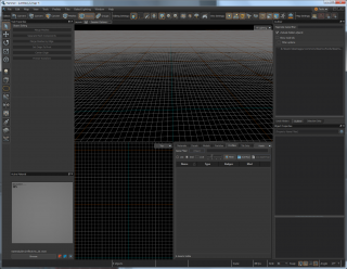
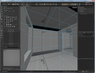
Create an empty map with File : New - this will bring up the view depicted in the screenshot to the right. The top central pane is the 3D view - you can switch modes using the popup menu to the top right of the pane. (Useful modes include All Lighting, which shows things how they will appear in-game; Fullbright which shows things without lighting, which is useful for editing purposes; and various 2D wireframe views which resemble architectural plans and elevations.
The red frame around the 3D view shows that it is currently active for input - any keypresses will go into the 3D view rather than into a text entry box or similar.
The two panes below are an overhead 2D wireframe view, and a small version of the Asset Browser allowing you to drag new props into the scene.
Other parts of the Hammer window include Tool Properties to the left, which provides tool-specific buttons and options, and Object Properties to the bottom right, which allows you to change the properties of whatever object (be it a mesh or entity) you currently have selected.
There are two toolbars - the one along the top allows you to switch between various selection modes, amongst other things, while the one on the left switches between particular tools, such as the selection tool, various translation tools (move, rotate, scale), entity placement, mesh creation and material painting and sculpting tools.
Vertices, Edges, Faces, Meshes, Objects and Groups
This list essentially goes from 'atoms' to 'galaxies', with Vertices being the simple, indivisible points which underlie all Hammer geometry. Next up are Edges, which are lines connecting two points, and then come Faces, which are flat polygon surfaces bounded by edges. Hammer has separate modes for editing each - you can cycle between them by pressing the space bar.
Next are Meshes, which are collections of (usually) attached faces. You can move them around as individual sections - you might have the walls, floor and ceiling as one mesh, and one set of window frames as another. Duplicating the window frame mesh gives a separate section which can be moved around separately - without making you go to the trouble of selecting just those faces in one particular mesh. (There's no hard rule as to how to break things into separate meshes - just go with what feels simplest!)
Then there are Objects. These can be meshes or entities - which are representations of things (physics props, pigeons, player start points, panels and other alliterative, interactive objects) in the world. Confusingly, an entity can contain a mesh - such as a door given the ability to move - clicking on it in Objects mode will select the entity, while clicking on it in Meshes mode will select the underlying mesh.
Finally, there are Groups, which are purely a concept in Hammer rather than in the final compiled map. Essentially the same as groups in vector graphics programs and 3D modelling software, these allow you to group together disparate selections of objects into an individual thing. You can only select groups while in this mode, otherwise you will click through to whatever is contained within.
The easiest way to navigate around your map in 3D is to right-click and hold on the 3D view then use the WASD controls to move around, similar to a first-person shooter game. You can also toggle fly-mode by pressing the Z key while the 3D pane is active; pressing it again makes it go away.
Hammer also includes 3D modelling program style navigation, where pressing shift-A will centre the view on the currently selected object, and holding the Alternate key and dragging with the left mouse button will orbit the view around that centre point. (Right-dragging moves in and out, while centre-dragging strafes the view left and right, up and down.)
Constructing Geometry
One of the liberating aspects of the version of Hammer in the SteamVR Home Workshop Tools is the myriad different methods you can use to build map geometry. There's no single, right way of doing it - you can learn more about the concepts and techniques involved in this series of articles on mesh construction.
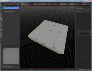
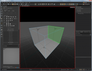
We'll start off our room with a simple box. Select the Block Tool from the toolbar on the left, then make sure the Geometry Type shown in the Tool Properties pane is set to block (other starting shapes such as cylinders and spheres are also possible, but we don't need them for now).
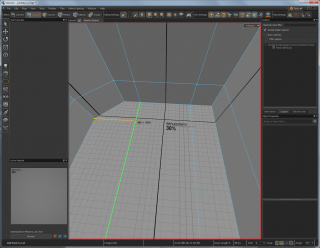
Next draw out a box on the 3D view with the left mouse button. You'll see it show various numbers on the edges - these are lengths in game units. Once you let go of the mouse button it will create an initial box - use the coloured spheres on the sides, top and bottom to scale it to the appropriate size. (The blue gizmos are on the top and bottom, so you don't get confused which way is up.)
Once you're happy with the size of this box, press Return to confirm.
Flipping Face Normals
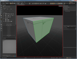
What we have right now is a solid, room-sized box - when we want it to be hollow instead. Faces in Hammer have a single, solid side, defined by a nebulous concept called a 'face normal' - a vector pointing in a particular direction. The general gist of it is that we want them all to face the other way. To do this, change to the Faces selection mode at the top left, double-click on your box to select all faces, then press the F key to flip normals. Your box should now be a hollow cuboid with no outwards-facing polygons. (Press F again to go back to what you had, then yet again to go to this hollow version.)
Translation Tools
The three main tools for changing aspects of a mesh are Move (the T key), Rotate (the R key) and Scale (the E key). Using these, you can move around vertices, edges, faces, meshes and entities - these are the main tools you'll be using when constructing your world. When active, controllable gizmos will be drawn in the 3D and 2D views. Simply drag with the mouse on the appropriate control to spin, scale or move in the direction you need.
A useful feature is the ability to duplicate or extend - hold down Shift and translate in a particular way for different effects. Shift-translating an edge can extend that edge into a new face; shift-translating a face will extrude that face; shift-translating an entity will duplicate that entity.
Selection
To select multiple things in a mesh, you can 'paint' over it by dragging the mouse over edges or faces - selected faces will be overdrawn in orange, while selected edges will be drawn in yellow. Clicking again will start the selection afresh; Shift-dragging will add to the selection, while Control-dragging will subtract from it. Pressing + and - on the keypad will expand and shrink the selection - adding or removing connected faces or edges surrounding the current selection.
The Grid
By default, operations are locked to the grid - there is a little popup menu at the bottom right of the window showing the current grid size in game units. This can be changed with the menu, or through the [ and ] keys. Since we're rebuilding a real-world location with inconvenient, non-power-of-two dimensions, shifting down to a grid size of one can be quite useful.
Edge Loops, and Mesh Manipulation
Changing between selection modes is another common aspect of using Hammer. When changing the shape or size of a face, it can often be better to switch to the Edges or even Vertices selection mode - moving just one set of edges can mean you change one section while leaving another area alone.
A useful concept in 3D modelling is that of the Edge Loop - a continuous loop of edges running right around an object. When a mesh is mostly or entirely constructed out of four-sided faces (called quads), you can double-click with the mouse on one edge in an edge loop to select the whole thing. Creating new edge loops can be extremely helpful.
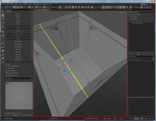
For our room, with windows and doors at either end, we'd like to split faces up. We'll start by selecting a Ring, which is almost like the opposite of an edge loop - rather than a continuous loop of edges, it is the edges connecting a loop of faces. This will become a bit more meaningful when seen in action - so switch to the Edges selection mode, click one of the edges on the shorter side of the room and press the G key to select the ring.
Now, to split all these faces down the middle and create a new edge loop, press the V key. This should add a new loop of edges cutting the room in two.
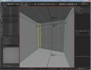
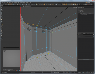
Now we can move the edge loop, so that the edges define the boundary of one side of the door and window. Enable the Move tool with T and then drag the loop towards one of the walls. You can check the distance from the wall by briefly mouse-overing one of the edges between the loop and the wall.
Next, select one of the longer edges between the new loop and the other wall, press G to select the ring then V to create another loop. Now move that to the appropriate distance from that wall.
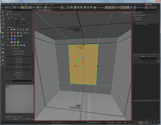
While the room will look the same as before without the useful wireframe overlay, we are building up useful cuts in the mesh for adding new faces. Create some more edge loops, this time by starting with one of the vertical edges connecting the floor to the ceiling, and define the bottom and top of the window. Nearly there - once you're done creating new edge loops, change to Faces selection mode and select the face that will be the window.
Extrusion
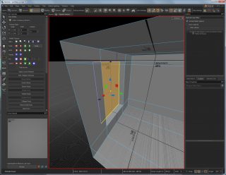
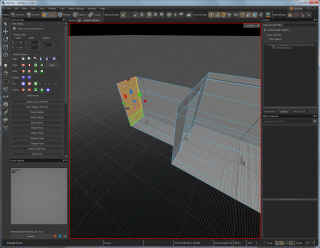
Using the Move tool, Shift-drag it out to extrude that face - it will create new faces and edges connecting the face to the rest of the mesh. Hopefully you can now see where we're going - cutting the mesh and then extruding sections out to build new structure.
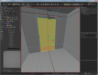
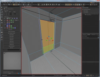
Faces don't need to be perfectly rectangular. Since the doorway is a different size to the window, we can move the edges around to get the correct shape, and as before we can briefly mouse-over edges to check their length against our real-world measurements. Once that's done, select the two faces making up the doorway and extrude them out with Shift-Move to create the beginnings of a hallway.
Our measurements are for two adjacent rooms. One way of creating that second room is to extrude that doorway out further to start blocking out that second room - Shift-Move it a second time to get the required length. (The status bar at the bottom shows Green Length: 150, which is what we need.
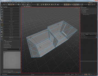
Now, like that doorway, we can extrude more faces out - make sure to select all that are needed as part of the far wall, floor or ceiling. Once we're done, we have two connected rooms blocked out.
Bevelling
A quick way of adding more detail is through bevelling - essentially adding extra faces along an edge. The bevel size is controlled by the grid size - see above for changing that. Here we'll want the grid size to be quite small, so as not to interfere with nearby geometry - we'll be moving the edges ourselves.
To add a section of diagonal wall for a corner fireplace, select the vertical edges in a corner, then press the F key. (Later on, we could use this for adding a smoother, angled transition between the ceiling and walls, or to chisel off sharp corners.)
Face Cutting
Once we've moved the edges either side of this angled wall to where we need them, we can stand back a moment - to realise that our carefully constructed, quads-only mesh now has some five-sided faces in it. While these can, depending on what is being done, be more than acceptable - we want this mesh to stay quads-only, for lighting-related reasons which will become clearer later on.
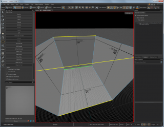
To do this, we'll use the Face Cut tool - press the C key to activate this. Click on an edge to split it in two, then on another edge on that face to split it along a line connecting the two points. This way, we can cut faces into smaller sections - and even add new edge loops this way. The new edge is highlighted in orange when the line is on the grid; the endpoint is highlighted in orange and drawn slightly larger when it is at the centre of the edge.
Using this tool, we can make things nice and quads-based again, by creating the rest of an edge loop along the floor, up the wall and across the ceiling. When complete, press the Return key.
Scaling Edge Loops
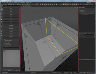
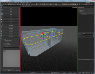
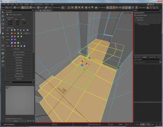
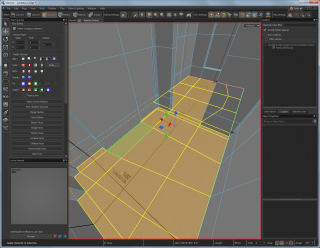
One advantage of working with edge loops is the speed at which they can be changed. In the following screenshot, I've added a new loop by selecting a ring going right around the rooms, then pressing V. The height is a bit variable, so to make it consistent I switched to the Scale tool before shrinking it down on the vertical Z axis by Control-dragging on the blue scale gizmo. (Holding down Control temporarily disables the grid snap.)
Creation through Deletion
You've probably made a splendid mess by now, and are wondering how to head towards a nicely clean and tidy mesh. Don't worry - deleting things can be a major part of creating them.
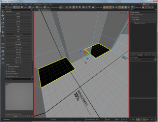
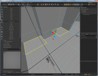
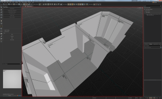
In the first room, we want to add a chimney breast to one of the walls - we could potentially do this by extruding out the sections of walls either side of it, but in this case we'll be extruding the central part of the wall inwards. After adding edge loops up the wall and around the room, we'll delete some of the faces on the floor and ceiling connecting the top and bottom of the wall to the rest of the room. Select them, then press Delete.
After extruding the chimney inwards, delete the new faces above and below. These aren't necessary, and will get in the way of what we do next.
Bridge
Creating new faces between distant ones is a useful means of creation. You might have two ends of a wall you need to connect together, or two ends of a pillar - wrangling the ends into the shapes needed to rapidly create the in-between geometry can be a good approach.
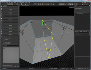
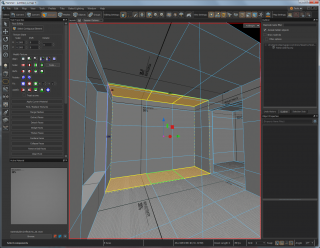
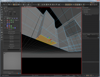
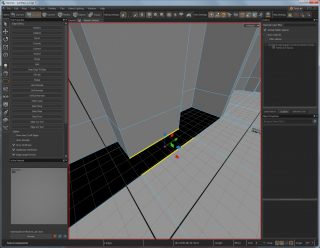
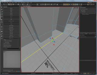
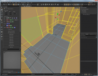
Our requirements here are a little more prosaic. We want to connect the base of the chimney to the rest of the floor - and to do this, we'll be using the Bridge tool. Select the two edges as shown in the picture, then press B to bridge them together with a new face. The ragged border to the edges show they only have faces on one side - edges need to be like this to allow the creation of another attached face.
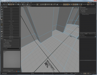
Once the new section of floor has been created, do the same with the ceiling.
Filling In Holes
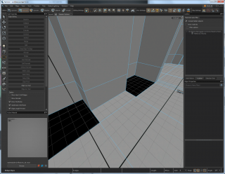
We still have holes in the floor and ceiling. These are very quick to fill - in Edges selection mode, double-click on one of the edges surrounding a hole to select a loop of edges surrounding it, then Shift-double-click an edge on the other hole to add that loop to the selection. Now press P to create new faces bordered by these edges. The same can be then done with the holes in the ceiling.
Removing Edges
We've broken our informal quads-only rule by creating some faces with five edges. Using the Face Cut tool to add some new edges can correct this to some extent - but now we have quads and triangles. How best to remove those excess edges? Selecting them and pressing Delete would remove the edges and attached faces, which is a little excessive - pressing Backspace instead will remove the edges and merge the adjoining faces together.
So now, we're back to having a pleasingly quad-based mesh again.
Saving the Map
Now is as good a time as any to mention this - to save the map, just go to File : Save. You'll want to keep your map in your addon's maps folder, but otherwise the save feature is very similar to other software. Keep your filenames to lower-case letters, numbers and underscores only.
Basic Materials
So far we've been using whatever material was active when we started. Our addon currently needs some more appropriate textures and materials adding, but as a placeholder indicating roughly what will be where we can assign some of the basic development textures. There are simple 'reflectivity' textures which can roughly approximate the surface albedo of real-world materials - this will later give us more accurate lighting to work with at this early blocking-out stage.
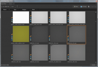
To make the floor a little darker, first select all the floor faces, then click the Browse button at the bottom left of the window, below the square Active Material. Scroll through until you find reflectivity_20.vmat, then click the Accept button at the bottom right. This has changed the active material, but now it needs to be applied to the currently selected materials - do this by clicking the Apply Current Material button below the Modify Texture controls to the left.
You could then go through and carefully select all the wall and ceiling faces, but a quick shortcut is to invert the selection with Edit : Invert Selection or by pressing Control-I. Then browse for a new material like reflectivity_70.vmat, then apply that material to the selected faces.
Now after all that, our initial room blockout is complete.
Basic Lighting
If we were to run our map right now, it would look incredibly flat - with no variation in the monotonous grey walls and floor. To add more realism and solidity to the scene, SteamVR Home has an advanced lighting system built in, which simulates the appearance of light sources on the world and on dynamic objects - from props and controllers to avatar heads.
Direct Light, Indirect Light and Environment Cubemaps
Since firing around billions or even trillions of virtual photons every second would be a little too computationally expensive for VR on a home computer, the lighting system takes some shortcuts - the first part being breaking the simulated light into multiple components.
- The direct part of a light source is usually fully dynamic, using per-pixel lighting based on distance and angle to each light source, and whether each point is in shadow or not. This is a good first approximation, but falls down on shadowed or occluded areas.
- Indirect lighting is the more subtle lighting provided by light bouncing around the scene - a sunlit wooden floor would bounce light up to the ceiling, while alcoves and crevices will look darker than more exposed areas. Good indirect lighting can contribute significantly to the realism and solidity of a scene, taking it from being a basic computer-generated view to something closer to reality. Calculating indirect lighting involves a separate stage, which might take a number of minutes depending on environment complexity - as in reality, it works by firing many photons around which can effectively bounce off surfaces into areas out of direct sight of a light source. Indirect lighting for dynamic objects (those props, controllers and avatars) is calculated from light probe volumes - low-resolution, three-dimensional grids
- Finally, there are Environment Cubemaps used for simulating reflections on objects. Internally, these are textures with views in all directions mapped to the inside of a cube - hence the name 'cubemaps'. These get generated automatically from positions marked in the map, and the resulting reflections are remapped to a virtual cuboid in order to give an apparent depth to the reflections. The cubemaps also have blurred versions calculated, allowing reflections from 'super-sharp' to 'subtle and diffuse' depending on surface material properties.
Placing Spotlights
Now to actually introduce some light to our scene. There are three main light sources available:
- Omni-lights - point lights which cast light out equally in all directions without casting shadows,
- Spotlights - lights sources which cast light out from a point in a specific, spotlight-like direction and can cast shadows, and finally
- Environment Lights - a directional light imitating the sun or other extremely distant light source. Good for illuminating large outdoors scenes in a manner mimicking sunlight or moonlight, this uses a technical feature called cascaded shadow maps to allow shadows to be cast over a wide area. You're likely only ever going to have one of these light sources in a scene at a time, or none at all.
For this indoors scene, we'll be placing some spotlights close to the ceiling shining down into the room, and another near a wall.
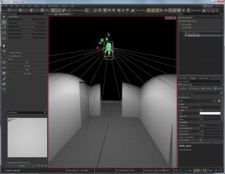
First, switch to the Entity tool - either by pressing the lightbulb-like icon on the left-hand toolbar, or by pressing Shift-E. The Tool Properties to the top left will show the Entity Class pop-up menu - you can double-click the current text in it and then start typing light_spot - click that name when you see the complete version. Now the tool is set to place spotlights in the world.
In the 3D view, navigate so that you can see the centre of the ceiling then left-click where you want the spotlight to be placed. If you have All Lighting set in the pop-up menu to the top right of the 3D view, the scene will go dark except for light shooting off to one side. You should see a green spotlight icon where you placed the light source - go back to the Selection tool (Shift-S), change to Objects selection mode then click the light source to select it. Change to Rotation mode (the R key) then spin it round so that is facing downwards - it should automatically update how the light source looks. It may be necessary to move the spotlight down a little too, depending on taste. (Having a spotlight embedded in the ceiling can cause Strange Things to happen with shadows.)
In the Object Properties pane to the bottom right, you can adjust the colour and brightness. I set my spotlight to very slight yellow with a brightness of 0.75.
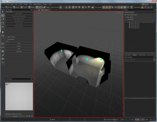
Still in Object selection mode, you can copy and paste (Control-C and Control-V) the spotlight into the second room - I placed a third copy near the wall about half-way up and made it dimmer and yellower, to mimic a floor lamp I had in that position.
With that, we're done placing our light sources. But this is direct light only - things look more than a little fake, with completely dark ceilings. How should we go about fixing that?
Subdivision
Remember how picky this tutorial was about keeping all the map geometry based around four-sided quads? At last, here comes a reason!
The current indirect lighting model works on vertex lighting - where the indirect light level is calculated for each vertex in a mesh, before being interpolated between these points. While indirect lighting is usually rather smooth and subtle, our rooms have very few vertices - there aren't many vertices between crevices and points in the middle of walls, so there is little geometric complexity for the lighting system to work with.
Fortunately, there's a quick and simple solution to this - the face subdivision system. While also used by the sculpting and vertex painting tools (to be explored later in these tutorials), we'll be using here to automatically split faces into smaller ones in a reversible manner.
Change to Faces selection mode and double-click on the mesh to select all faces, then press the Comma key to increase the subdivision level. Press Comma again to increase the subdivision level another step, and the Full Stop (or Period) key to decrease the subdivision level. Decreasing the level enough will remove the subdivision entirely.
Since we don't want too much geometry, we can just keep it at the first subdivision level.
Light Probes
Remember the indirect light volumes and environment cubemaps mentioned earlier? Here's where we get to place the entities responsible into the map.
Change back to the Entity Tool, then in the Entity Class menu start typing env_combined_light_probe_volume - again, click on the full name when it appears.
Place one of these entities in the centre of a room. You may need to move it about, so switch back to the Selection tool and the Objects selection mode to select it before using the Move translation tool.
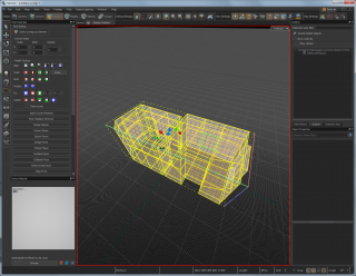
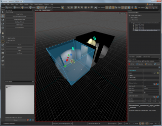
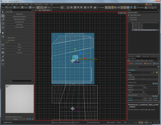
You'll notice that the light probe entity is being drawn with a box around it - these are the bounds of the light probe volume, as well as being the bounds of the cubemap projection box. We want these to enclose the whole room, so in the 2D view drag on the dots on each side to go just beyond the walls, floor and ceiling. The doorway between the rooms will be a transition point between the two light probes, so get the boundary to be just beyond the middle.
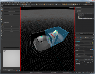
Now in an overhead 2D view, you can use the Move tool to Shift-translate the light probe to create a copy of this entity - make sure you only Shift-translate once, otherwise you'll end up with multiple copies! Move this to the centre of the second room, then adjust the bounds accordingly.
Baking Light
The map is now ready for calculating the indirect light, that computationally intensive task which needs to bounce many virtual photons around the scene. Bizarrely, this is referred to as baking light - the idea being that the ingredients for the cake are ready, they just need to be put in the oven to bake for a bit.
Fortunately, this computationally complex task is simple enough for a human to initiate. Save your map, then go to Baked Lighting : Bake All Lighting. This will pop up a command window which will whizz through some mysterious text, before closing and popping up a few progress bars indicating that it is generating the cubemaps.
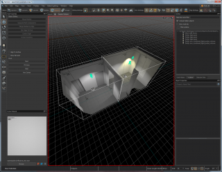
Now, with a bit of luck, you should have a map with full lighting - the formerly pitch-black ceiling will be illuminated by light bouncing off the floor and walls. While still very basic, we now have a good framework to work with visual improvements - as the map improves, the lighting will look increasingly realistic. Getting entities set up correctly was an important part of this.
Save the map again so you don't lose these changes. We're soon going to get this into VR!
Adding a Player Start Entity
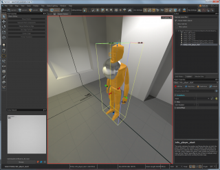
After all this work, it's time to mark where we want to enter our map. Change back to the Entity tool, then set it to info_player_start. Click somewhere on the floor in the centre of a room to place a polygonal orange Gordon Freeman. This is the point where you'll be placed when entering the map in VR. You can also rotate the entity to change the default 'forward' direction - in the real world, this is usually away from your computer, or towards the sensor cameras.
Compiling and Running the Map
It's been something of a marathon to get here, but we've covered so much along the way. From building geometry to correct lighting setup, we're finally here - seeing what we've built in VR.
To convert all this map data into a form that the engine can display at the ridiculous framerates required for VR requires compilation - basically squishing everything into super-speedy data structures and throwing away anything that isn't needed. Like baking indirect light, this is quite a computationally complex thing - but it's simple enough for the user.
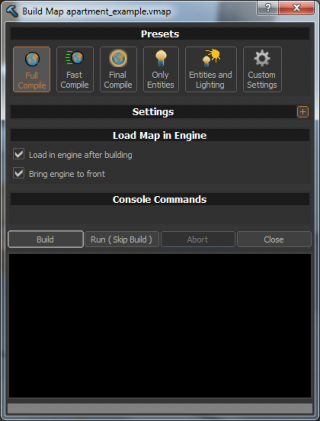
Press F9 to bring up the Build Map dialogue box, then with Full Compile set (the default), click on Build. This should whizz some more mysterious text up in a box (this time multicoloured), and if Load in engine after building is checked (again the default), it'll run the map in VR.
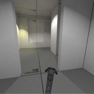
Put on your headset, and visit the place you have created.
Coming Next
In the next tutorial, we'll be looking at materials, details and props - taking these bland, grey walls and floors and replacing them with something more realistic and aesthetically pleasing.
