Portal – Tutorial – Designing Test Chambers
January 2024
The most important thing in any map is design and detail. This is especially important when making a Portal map. Such a test chamber map needs to have a well planned out layout, be fun to play, and be visually attractive for the player.
Construction
The Blockout Process
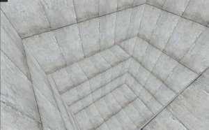
The first step to use when making a Portal map is to first design a rough, and simple map. This is generally done with dev textures, and it is generally completed in about 4-5 minutes. At this point, you should thoroughly play test this area, and determine what areas will be portable and non portable.
Detailing Portal Placement Locations
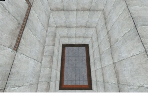
Now detail the areas where portals will be placed. I moved the top section in and added a hazard texture, and I shrunk the floor and made it into a platform.
Rough Metal Texturing
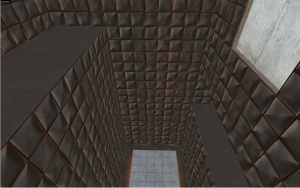
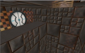
Now add metal textures where players will not be able to place portals on. The metal textures will have standard detail for now. Play test this section again, and find any glitches.
Gameplay Elements
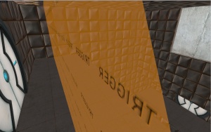
Now add doors, buttons, catchers, and triggers for the area. Now play test the section thoroughly. It will be very difficult to modify the detailed walls afterwards.
Detailing Metal Walls
Add detail to your metal walls. See Detailing metal walls for more information. Generally, you will want to have smaller metal blocks on the bottom, and bigger on the top.
Adding Interior Lighting
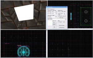
Next add lights. The trick is to have them uneven. That way it is more attractive. The best white texture to use is white001.
Final Result & Minor Fixes
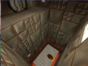
Admire a job well done and fix minor texture alignments and bugs.
