User:Chickenmobile/Map Design
All good maps in a Deathmatch kind of map all have to have flow and style, plus a continuing theme and a kind of uniquness that no other map has. Remember that your map should be entirely your map. Do not use parts from maps that are not your own as that can clash with copyright and ownership. Keep it clean and leave it entirely your own (unless you get permission).
Designing
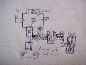
A good map should be thoroughly planned before starting. A simple sketch should be enough to plan out all the doorways, sections and areas that are needed in a map. This should be done on a physical piece of paper. Remember sketch not accurately draw your plan, this is usually done for brainstorming your design rather than designing completely what it should look like. When you got a sketch that you are happy with then start designing more in detail of what you want your map to look like. Usually drawing on a piece of paper is better than on a computer as it is definitely quicker and ideas can easily slip out of a head, it is better to get them quickly down on paper. If you have started thinking about the actual 3D look of your map, if you can sketch it also on a real piece of paper including things like weapons and props. Also think about levels and stairs in your map, not all are flat, but a flat design is definitely easier to design. Different levels make a map interesting and more surprising of where an opponent will come from but too many hiding spots do not make it a very balanced map. So for an example I’m going to make good-designed map and insert the screen shots of the map progression. I will leave the downloadable .bsp of the map in the links below.
Note: Not all information here is true for all map designs, rather I’m telling you the principles of design that make a map ‘look and feel’ good from my opinions as both a map maker and a gamer. These two properties are helpful in creating a map a player would enjoy but there is the problem that you will play the map more than actually making it =S.
Good Designs
I have noticed that all good maps for 1v1 competitions have similar layouts. Just to point it out to you I’m going to describe two.
dm_lockdown is an incredibly popular 1v1 map and just so happens is one of the original maps made by Valve. What makes this map good is the fact that the map ‘flows’ together with all hallways and the rooms connect in some way (except for a few rooms with ammo in them), with a hint of choice in which direction the player wants to go. All weapons are evenly spread about the map and it is definitely one of the most balanced maps around. The two levels and wide hallways also are good for ‘speed-skaters’ and ‘bunny-hoppers’ that make use of corners and ledge jumps.
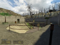
dm_lostarena is a map that has curved walls connecting together a series of buildings and hallways. Its look and feel is greatly positive as the colours are that used are warm and the curves of each of the walls give it a natural and friendly feel. It is definitely easy to navigate and through mild use of props and things like teleporters and a jump platform. This map again has 2 levels (surprise there) and almost every room and hallway is connected to 2-3 pathways.
Well from the conclusion of my research (2 maps =D), it is fair to say that a good balanced map has:
- Subtle props
- 2 levels (or storeys)
- Main areas with wide hallways linking them together
- Consistency in texture, theme and structure
- Choice of where to go, although not too many choices (usually 2-3 entrances or exits)
- A range of different weapons scattered about the map
- Sound
A Few Tips in Designing
- Never put something in that is too unrealistic. A floating block with no supports can acquire interest from a player but then becomes annoying or just weird. If you map has the theme of a ‘killbox’ it does not matter as much but it is still better to join blocks or brushes to keep a flow in a map as no flow just creates chaos.
- If you are creating a realistic map like that of lockdown or other similar maps, be sure to keep it to a theme, or keep rooms and hallways similar in design. If the map changes too much it may become confusing for the players when travelling in the map. Wouldn’t you be creeped out if a jungle led into a casino? The two do not match at all and although it can be amusing, it is not a good mapping technique. Also keeping your map in similar design means that you can reuse bits of your maps for other parts. Like a doorway can be reused elsewhere and there is no need to look for new textures, reducing the time creating the map and also reducing the size of the finished map file.
- Keep the map interesting. The pure design of a map is usually not enough. Textures, props and a soundscape contribute to the atmosphere of a map. Do not go overboard with things though, it is not about enjoying the atmosphere rather it is a mix between good and fair combat and good design. Avoid ragdolls, too many overlays (like graffiti) and props that just get in the way.
- Never put a room with a dead-end unless it has something important in it like a good weapon or something worth getting (like a super armour charger or lots of health packs). You will find that your efforts of making that room in the first place would be wasted because no one would want to go there.
- Always put a light source in somewhere like a large glass roof or windows, a dark map is not necessarily an attractive one.
- Put something like a trademark in your map. For example in all the default Valve maps:
- Lockdown - the fan room and the amount of explosive barrels
- Runoff - the nuke
- Overwatch - the rocket
- Steamlab - the explosive steam
- Underpass - the navigation of going underground and above ground, and lastly,
- Powerhouse - the knowing that you are going to intercept someone sometime with its crazy assortment of rooms.
My Good-Design Map Example
After looking long and hard at how to make a wiki I found out how to upload images and creating simple headings and other cool things, I will only take screen shots of the design not the actual entities and others that I am going to create, and explain throughout the making why I placed things where.
Starting off
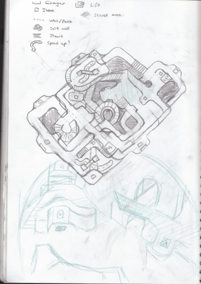
I made my sketch and after basing it a lot on lostarena I decided that it would be a bit of a tribute of how much I really like this map. I also made a simple 3D sketch as an example in green pencil (no I am not the best 3D drawer in the world) but ths definitely helped me of the visual component of making a map.
From the research before, it also helped me of how I wanted the map to look like and I quickly jotted any ideas that came to me (in a brainstorm) on a different peice of paper. No I'm not going to upload a picture but rather I'm going to tell you what I put on that peice of paper.
- Curved
- Chargers
- Two levels
- Hanging trees and a cubby house
- Cool distant objects (namely warehouses, smiley cactuses!)
- Custom textures?
- Speed ups
- Cool jumps
- Secret holes in walls (weapons?)
- Areas only accessible by strafe jumping
- My logo :P
- Flooding?
- Shoot through platforms on top level
- Secret underwater tunnel
- Cookies.. mmm.
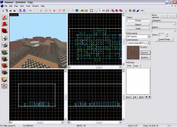
Now that I have totally got what I wanted and a few ideas of what I'm going to put in it Im going to go into hammer and start creating my map!
Creating Map in Hammer
Just to be clear to you all, I usually start a map with a hollowed box and work around in box, since this map is almost rectangular I am going to do the same but edit the regions of where the skybox is later. Putting a giant skybox around the map may get all the VVIS the Vrad to work but it makes the map have too many portal areas and increases the map size in the end.
Now to get to work...


