SteamVR/Environments/Advanced Indoors Photogrammetry
Many people choose to capture their own homes as their first photogrammetry projects - without realising that modern, interior architectural scenes can be some of the hardest to scan well. Featureless, blank painted surfaces, reflections, specularity, the exacting perfection needed to make clean, manufactured surfaces not look distorted and misshapen - even the best source photography will fail to capture everything.
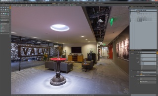
If you're looking for an initial project, try something lumpy, organic and full of detail - paradoxically, some of the things hardest to model and texture conventionally are the easiest to capture. The Advanced Outdoors Photogrammetry tutorial should help you there, and should also act as a good starting point for some of the techniques used here - should you be willing to take the plunge into something much trickier, this tutorial will document the scan and cleanup of the Valve Lobby scene available in SteamVR Home.
Capture
The camera I used was again a Canon EOS 7D, this time with the EF-S 17-55mm f/2.8 lens at 17mm. To ensure maximum image sharpness and consistency, a tripod was used - I started with a manual exposure of f/11, 1.6 seconds at ISO 100. Image stabilisation was switched off, to stop the lens getting confused into attempting to correct non-existent wobbles. Both the zoom ring and focus ring were taped into position to prevent any accidental shifts - the zoom ring at its widest, and the lens set to manual focus at an approximate hyperfocal distance of 1m for maximum depth of field. (Keeping the focus the same across shots also avoids any changes due to focus breathing.)
I took just over 600 photos, with the camera in portrait orientation - making it easier to capture floor-to-ceiling shots. For various areas (the large metal valve assembly in the centre of the lobby in particular) I took shots from different heights - looking from below, above and in the middle, orbiting around objects to get decent coverage from all angles. Using a wide angle lens helped ensure at least some coverage for everything - with such a large scene as this, it is easy to accidentally miss things. Try not to be too clever about how you capture - it's better to take too many photos than too few. If in doubt, always take more - especially when transitioning between different areas.
I took a fair number of shots from outside the publicly accessible areas, looking back in through the glass - these proved fairly tricky to align relative to the rest of the bulk of the photos due to reflections from the glass boundaries and limited shared coverage.
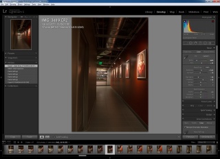
As with the outdoors scenes, the camera was set to shoot in RAW format, thus providing a bit more dynamic range to work with and the ability to further tweak shots in Lightroom - processing there was limited to setting a good white balance, tweaking exposure, pulling in shadows and highlights and correcting chromatic aberration and lens vignetting. The same develop settings were applied to all images for uniformity, with the only shot-specific adjustments being to correct for an accidental change in exposure around half-way through - the command wheel on the back of the camera got nudged to 2 seconds. This was easily corrected out using Lightroom's 'Settings : Match Total Exposures' function - and will be prevented in future with the use of the little command wheel 'Lock' switch on the back of the camera. (So that's what it's for!)
Processed photos were then exported to 8-bit, full-sized TIFFs - minimally compressed JPEGs would also have worked, but I wanted to make sure I'd get the absolute best detail in the low-contrast, near-featureless painted walls and ceilings.
Reconstruction
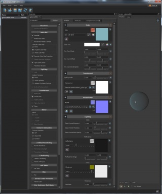
I used Reality Capture for all reconstruction and texturing in this scene - recent updates have made it much more forgiving when it comes to importing modified meshes with new UVs and materials.
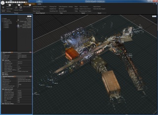
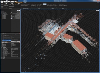
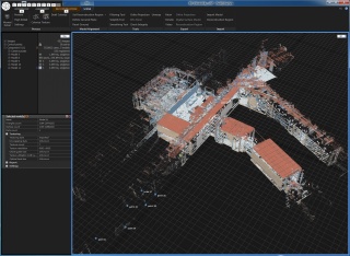
Getting a good camera alignment was initially quite difficult - limited shots in a few places meant I had to add control points to various photos in order to align separate components together. After getting around 550 of the 600-odd photos aligned, I set it to build a high-detail mesh - this, unsurprisingly, took a fair amount of time. Having a decent GPU, CPU and plenty of memory certainly helps things along.
I ended up with a mesh approaching 400 million triangles - definitely too much to render in VR - then decimated it down to three million. While a bit higher than I'd normally need, I expected to trim quite a lot from this scene, but still wanted detailed objects to retain a fair triangle count.
I then performed an automatic model unwrap to create some UVs, and generated the initial textures - then exported everything as an .OBJ.
Initial Cleanup
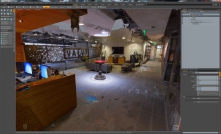
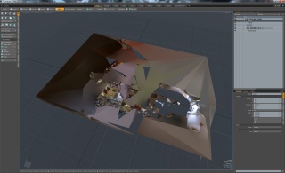
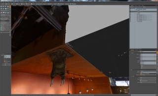
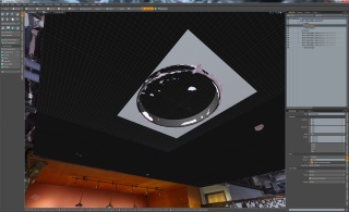
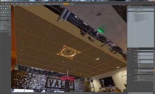
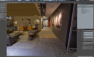
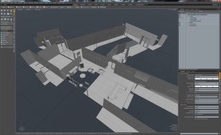
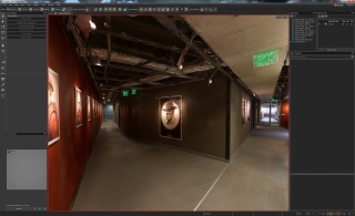
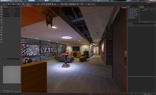
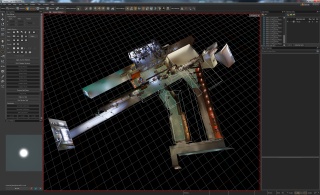
A first glimpse at the reconstructed mesh in Modo does not look good. With huge sections missing - ceilings, walls and sections of floor - the rest has billowy, interpolated geometry connecting vague sections together. Remember what I said about some of the hardest things to model are the easiest to capture? Fortunately, the reverse is also true - the missing walls, ceilings and floors may be difficult to capture but are relatively straightforward to remodel. Detailed sections of the scene are mostly captured intact.
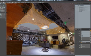
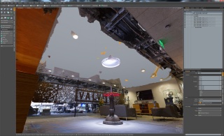
I trimmed away all the geometry boxing in the scene, then started trimming out poorly reconstructed areas such as the ceiling and walls - keeping a copy of this broken geometry in a separate mesh to act as a reference for rebuilding new, clean, low-poly replacements.
After rebuilding a reasonable amount of geometry this way, I generated some quick atlased UVs for it and assigned a new material. Reality Capture seems to identify materials suitable for generating textures by whether they have an existing texture assigned - whether it contains anything useful or not. So, I added a quick, blank texture to the replacement geometry's material before temporarily resetting the Locator's rotation, converting everything to triangles, deleting the unused, broken high-poly reference geometry and exporting to .OBJ for importing into Reality Capture.
Retexturing in Reality Capture
On reimporting the mesh into Reality Capture, as a sanity check I first ensured that overall scale and alignment looked about right - that the cameras where placed in roughly the right positions. (I have forgotten to reset various things before exporting in the past.) Then I checked the texture count for the newly imported model - where previously it had six textures, it now had seven.
My new material and UVs looked like they were ready!
I next calculated new textures, then exported to a new mesh with textures before reopening in Modo.
Further Cleanup
Performing cleanup on a large, interior scene like this can be extremely time-consuming, although most of the tasks involved can be quite simple. I'll summarise a few extra techniques and tips here.
Generating New UVs for the High-Poly Mesh
Whenever I made additive changes to the high-poly, reconstructed mesh - such as adding new geometry, or closing small holes and glitches in MeshLab - I needed to regenerate new UVs for it. I did this by exporting just the remaining high-poly mesh from Modo, importing that into Reality Capture, performing a new Unwrap before exporting as a new mesh. Without generating new textures, I'd end up with placeholder, checkerboard textures on it - depending on what I was doing, this could be enough.
Since I wanted to maintain my nice, quad-based low-poly geometry while continuing to edit, maintaining material assignments could get tricky. I'd often reimport a fully-textured, complete mesh from Reality Capture and then delete the low-poly, triangulated geometry from it (selecting polygons by material first being really useful) before reassigning the new materials to the separate, original low-poly sections.
Rebuilding Objects
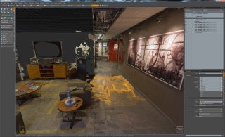
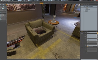
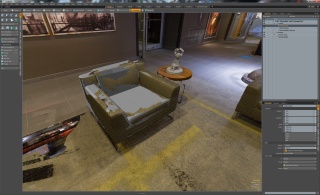
Despite being simple, lumpy objects covered in photogrammetric detail, I did a surprisingly bad job of taking photos of some of the armchairs in the lobby - I expect I was too busy concentrating on the more difficult objects in the scene. Fortunately, it was straightforward to remodel a particularly badly reconstructed example - I used the rough scanned geometry as an outline for modelling the new version. Once that was done, I removed the scanned armchair geometry and filed it away in the hidden reference mesh, just in case I needed it again later.
Other segments, such as the low coffee tables, parts of the front desk, sections of shelves and others, were remodelled in a similar manner. Several architectural sections, such as the lift lobby, ended up being almost completely remodelled.
Slip UVs
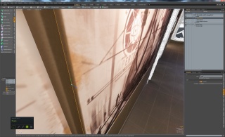
For adjusting newly rebuilt geometry in order to better match reality, Modo's 'Slip UVs' can be surprisingly useful. Select an edge, engage a transform tool and click 'Slip UVs' and you can get a much better idea of where to adjust things to - this works best on reasonably sensible UVs. (Even basic atlased UVs can be enough.) Very handy for slightly tweaking size and shape of rebuild objects.
Finalising Geometry and UVs
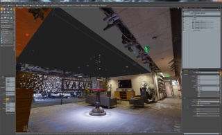
I went through a slow and constant back-and-forth between Modo and Reality Capture, steadily trimming away unnecessary high-poly reconstructed geometry and replacing it with clean, rebuilt low-poly geometry. The initial scanned mesh started at three million triangles, while the end result is just under two million - and that's with all the rebuilt geometry too.
I'd frequently get an in-progress version up and running in VR, so I could better visualise what I was working on. Spending too much time on something insignificant or barely visible can be easily avoided that way - better concentrate effort on things that make an effective difference.
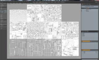
Once I was happy with UVs (in particular a sensible, comprehensible, repacked layout for my new geometry with appropriate texel density for everything) I could at last texture a definitive version for texture cleanup - work on textures is best done after layout is complete.
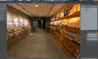
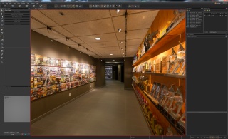
The lobby scene ended up with three 8k-square textures on low-poly replacement geometry (one mostly floors and ceilings, another walls, and a third for details - furniture, pictures, door frames, electrical sockets etc.) and eight other 8k textures with auto-generated UVs for high-poly scanned geometry.
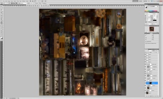
Texture Cleanup in Photoshop
While I worked hard to ensure consistent exposure and lighting in the source photography, specularity on the floor and walls still produced some unevenness in texturing. To partly mitigate this, I generated a second set of textures in Reality Capture, this time using the 'Linear' and 'Photo consistency based' texturing and colouring styles, rather than the standard 'Multi-band' and 'Visibility based' styles. This is not as good as extracting detail as the standard methods, tending to average multiple photos out to a greater extent and leaving faint 'shadows' from intervening objects and surfaces, but is useful for calculating smoother lighting on those flat, featureless surfaces. I used the standard, previously generated textures as a base layer and blended in sections of the new versions using a layer mask.
In other areas, I cloned in better reconstructed texture detail from elsewhere - there were segments of carpet around and underneath the coffee tables that needed this, along with many other glitches and inconsistencies throughout the scene.
I also did some basic gamma correction - the initial version of the texturing felt too bright in the headset when compared with the real scene, so I ended up applying a gamma of 0.925 to all the textures, to darken the overall tone and increase contrast to some extent.
mogrify -format png -gamma 0.925 *.png - be aware that this will overwrite existing .PNGs!Another trick I used was to take two copies of a particular section and apply a heavy blur to one version, then a fine high-pass filter to another - with the latter on top of the former with the 'overlay' blend mode set, using a group layer mask I could smooth out medium-sized inconsistencies while preserving fine detail such as paint roughness, carpet pile and suchlike.
Scene Setup in Hammer
I got the required scale by finding the size of one of the doorways in the real world - converting that to inches, equivalent to game units, and comparing it with the height of that doorway in Hammer meant I could get an overall scale factor for the whole mesh.
That mesh was set to 'Bake to World', breaking it into sections at compile time thereby reducing the amount of geometry that would be rendered when moving around the scene.
Teleport Areas
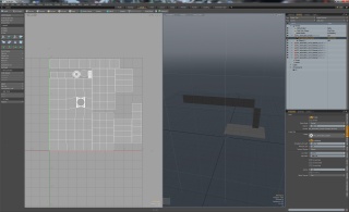
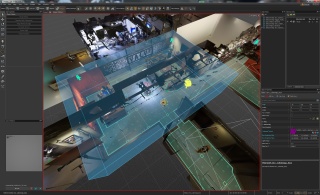
These were created in Hammer, initially using the 'Polygon' tool - I added various holes and adjustments using the rest of the mesh editing tools before selecting all the outer edges and using the 'Extend' tool to create the outer, solid borders. More information on creating teleport areas is available here.
Glass and Other Details
Geometry for these could have been built in Modo, but I thought I'd put Hammer's own geometry editing to the test. Simple cuboids and planes where glass walls, doors, windows, trophies and cabinets needed to be, I set up some basic glass materials to provide some much-needed reflections and life to the scene. These used the light sources and cubemaps I'll describe next.
Box Cubemaps
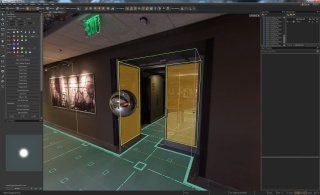
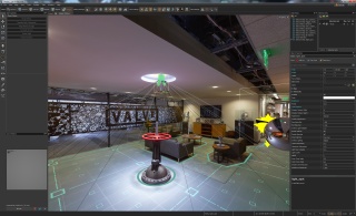
For reflections in the world and ambient lighting on dynamic props, I needed to create some box cubemaps. A more detailed overview on creating them is available here and here - the general gist for this scene is that I set the boundaries to match up with the walls and ceilings of each room or area each cubemap was placed in. For tricker sections, such as thin glass doors requiring independent reflections on both sides, the boundaries for each were carefully set to only enclose the face needing that cubemap - for a thin surface, this involved some very precise adjustment.
Surrogate Lighting
For dynamic props and player avatars, some light sources are required. Ambient lighting is provided by the box cubemaps described above. While such light sources will not actively provide lighting for the unlit shader used for the world geometry, it is possible to set the world to receive shadows from a particular light source - hugely helping to ground transient, dynamic objects into the world.
I made sure that all unlit world materials were set to receive shadows but not cast them - to prevent peculiar self-shadowing artifacts. I then added a simple, downwards-facing light_environment light source with shadows enabled - tweaking the colour and brightness to provide some basic, additional ambient lighting.
I then added a number of unshadowed light_spot spotlights through the scene to impersonate particular real-world spotlights or well-lit areas, again matching up colours and intensities by eye.
Finishing the Scene
An audio designer here worked on adding authentic soundscapes to the scene - a process documented in brief here - while some basic interactivity was also added using simple entity logic and triggers, documented here.
The end results are available as a new, standard scene in SteamVR Home. Have fun exploring!
