File talk:TextureFlowchart.jpg: Difference between revisions
Jump to navigation
Jump to search
Angry Beaver (talk | contribs) m (the one time i dont preview) |
No edit summary |
||
| Line 2: | Line 2: | ||
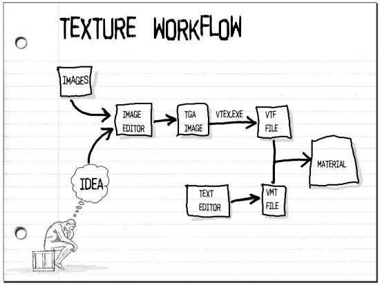
:While it's a little more "artistically" drawn, my flowchart explains a little more. We could vote. Also I could change mine if it needs some fixing. I didn't know that that flowchart existed. It isn't linked to any article. How did you find it? --[[User:Andreasen|Andreasen]] 17:24, 26 Nov 2006 (PST) | :While it's a little more "artistically" drawn, my flowchart explains a little more. We could vote. Also I could change mine if it needs some fixing. I didn't know that that flowchart existed. It isn't linked to any article. How did you find it? --[[User:Andreasen|Andreasen]] 17:24, 26 Nov 2006 (PST) | ||
::I remebered it from the [[Crate Versus Barrel]] Article. The problem with yours is its got that culltered look. its the too much information syndrom of that it gets complicated to look at. Fading out some information so its not so heavy and thinking down joining arrows may help. Also isolation the icons in a form of container may go a long way. --[[User:Angry Beaver|Angry Beaver]] 17:52, 26 Nov 2006 (PST) | ::I remebered it from the [[Crate Versus Barrel]] Article. The problem with yours is its got that culltered look. its the too much information syndrom of that it gets complicated to look at. Fading out some information so its not so heavy and thinking down joining arrows may help. Also isolation the icons in a form of container may go a long way. --[[User:Angry Beaver|Angry Beaver]] 17:52, 26 Nov 2006 (PST) | ||
You should box your text and enlarge the distance between them—'''[[User:Ts2do|ts2do]]''' 18:40, 26 Nov 2006 (PST) | |||
Revision as of 19:40, 26 November 2006
 Personaly I prefer this one --Angry Beaver 17:15, 26 Nov 2006 (PST)
- While it's a little more "artistically" drawn, my flowchart explains a little more. We could vote. Also I could change mine if it needs some fixing. I didn't know that that flowchart existed. It isn't linked to any article. How did you find it? --Andreasen 17:24, 26 Nov 2006 (PST)
- I remebered it from the Crate Versus Barrel Article. The problem with yours is its got that culltered look. its the too much information syndrom of that it gets complicated to look at. Fading out some information so its not so heavy and thinking down joining arrows may help. Also isolation the icons in a form of container may go a long way. --Angry Beaver 17:52, 26 Nov 2006 (PST)
You should box your text and enlarge the distance between them—ts2do 18:40, 26 Nov 2006 (PST)