Color theory (level design)
Color Theory in General
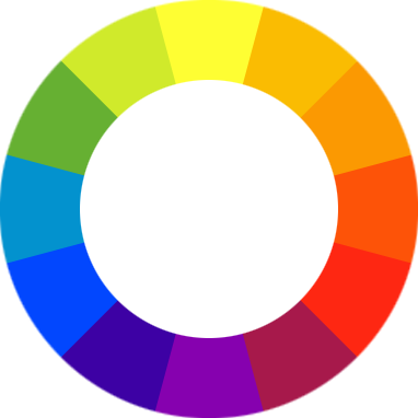
First a bit on color theory in a general practice: Wikipedia (look below) tells us the color wheel is set up to show 12 important colors. 3 are primary, 3 are secondary (mixing the primary colors) and 6 tertiary colors (created by mixing primary and secondary colors). Your primary colors form a triangle, (Yellow, Blue and Red). The secondary colors (Green, Purple and Orange are directly in between the primary colors). These also form an upside down triangle. The tertiary colors are in between the primary and secondary colors and will provide your shades of colors. This is important because of how people perceive color combinations.
Using colors
Colors found next to each other blend well, colors directly across contrast each other, and colors 1/3 the way round help accent. This means if you were to use yellow then the colors yellowy-green, pale orange, blue, red, and purple can all work with it if used properly. The key comes from the fact that if you choose yellowy-green to work with yellow then blue becomes a tricky color to use as blue doesn't work cleanley with yellowy-green.
The colors you pick define where the eye will goto and rest, what parts of the image the player notices and what looks like it belongs there. To clarify lets go over some examples.
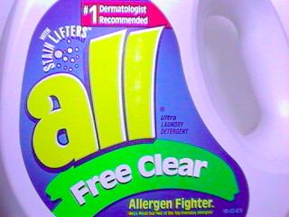
This is a solid exmaple of using complimentary colors to work to a nice visualy appealing goal. The colors work together and you can see each color fitting in with the rest. The things your attention are drawn to are the focus of the image.
This is another approach to the same bottle, the color pallete in its entirety has been shifted, no individual color changed on its own, all colors changed the same ammount. It all still fits together proving that an establsihed pallete is the key to a solid image.
This personifies what not to do, colors taken randomly from everywhere thrown together to make a mess of what can be a good image. Simple changes to some of the colors can make it look normal, but its current state screams issues and poor quality. You find yourslef looking at the wrong things because they stand out.
This is where it becomes more practical, the base pallete for the level begins at the walls the cream, dusty red and burgenday set up a solid color range with nice accents and the burgendy as a slight contrast. The burgendy and cream gets carried into the floor tiles and rust in the railings creating strong visually appealing floors and railing that fit in. the celings blend in niceley going for the more cream approach. the antlions being very earthy browns and organes blend into the scene easily as they blend well with the colors of the walls and floors.
The Combine and the concrete however form a very blue pallete between their uniforms and the plae blue grey found in the floors. This also continues into the barrels. So we have 2 palletes, usually that is a poor approach but lets roll back to the color wheel and look where the palletes place. Oranges and red sit opposite and 1/3 of the way round from the blue, because of this fact they appear to accent and contrast thus sitting together niceley in the same image.
Shifting the blue colors to a military green and an outdoor grass would create a green pallete, while this lines up at 1/3 on the color wheel the result would not be as appealing as it does not match on as many levels.
In the image your first focus is the combine, thier blue contrasts the main pallete forcing you to notice them, as you follow the combine you notice the antlions as they blend in with the walls and ground but dont match it. Following the walls you explore the scene catching the bright light above for a few moments. Eventually your eyes come to rest on the barrels as they stand out the most using a shade of blue that doesn't fit in with the rest of the image as well as evertyhing else does.
Colors Meanings
Colors don't just simply sit and look pretty, their the base to everything you see and often what you feel about the object. Everyone has a favorite color and will have an odd bias towards anything that matches that color. Along the same lines come the feeling of coldness from blues and greys, warmth from red, colors invoke emotions and making a bias in your pallete to help give somewhere and atmosphere is a very adavnced and good tactic to use in level design. Its not all matching up colors, you need to use the color to give an impression or a thought aswell. Nice bright clean light creates cleaner atospheres, but if you go inside and the light is a dull yellow it can create an oppressive feel, if you went for a teal or blue it can create a cold distant feel. Color lies not jsut in texture but in light too.
If you had a grey wall with an yellow dumpster next to a blue dumpster, where do you think the player will expect an enemy to jump out of? Knowing the odds of the player expecting an enemy to jump from the yellow dumpster, how can you use that to your advantage? If you’re going for horror and want to scare the player, trick them up and send the enemy coming from the blue dumpster. Using color to define objects like red lights for broken objects it seems like common sense but its all part of color theory.
Go out and look at all your own levels and see how you can make them look just a little bit better by proper use of color.


