Color theory (level design)
Color Theory in General
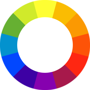
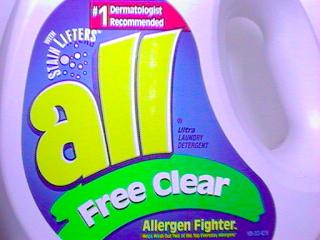
First a bit on color theory in a general practice: Wikipedia (look below) tells us the color wheel is set up to show 12 important colors. 3 are primary, 3 are secondary (mixing the primary colors) and 6 tertiary colors (created by mixing primary and secondary colors). Your primary colors form a triangle, (Yellow, Blue and Red). The secondary colors (Green, Purple and Orange are directly in between the primary colors). These also form an upside down triangle. The tertiary colors are in between the primary and secondary colors and will provide your shades of colors. This is important because of how people perceive color combinations. For example, we have a detergent box. The first one is the original packaging, which is a great example of complimentary colors. These are colors that are opposite of each other on the color wheel (Blue and Purple is on the bottom, and Yellow is on the top).
I have altered the box to use a palette closer to what you’d expect in the Half-Life world. It looks ok, but doesn’t have any of the punch the original packaging has. The ugly one was created using little to no thought on color as the result shows it.
This is the power of color theory. Let’s look at a example closer to what we’re all interested in. Levels.
Prison Scene
Here we have an example of color theory in a half-life 2 level. Color Palette: The color Palette shows us that our trusty level designers care about every aspect of their environments, including light and color theory. We see the world, which is overly brown with some earthy tones is being very nicely complimented with blue characters. (Check out the color wheel, brown tints are on the opposite side of blue.) The actual shades are a bit more earthy than the color wheel shows, however; our design principle still works well. The world is meant to look big, desolate and somewhat cold. Just like any decent prison should. We still have that, but it’s achieved with lighting from above. That’s the power of light. In order to avoid blue characters in a blue world, which doesn’t look as striking, Valve decided to change up the color from the ceiling (blue and cold) to the rest of the room (warmer with brown tones).
Back to the image: Look at the image, and consider the composition of the screenshot. What makes video games so interesting to develop is the ability to use the very basics of design, such as color and line to the advanced basics of an interactive environment, such as animation and physics (explosions etc). These are all tools at the level designer’s disposal. So, back to the image. Where does your eye lead to at first? This is sometimes different to the viewer, but in this image my eye is first lead to the Combine’s gun fire, then to the bugs and somehow directly to those barrels. See that? Why the barrels, there’s nothing really special about them, but most people when asked about this image say that the barrels are where the eye usually ends up resting. Notice the color of those barrels is green, and that the only green in the entire screenshot is in fact in the barrels. It’s a very subtle, but very powerful way to grab your player’s attention in a scene.
If you had a brown wall with an orange dumpster next to a blue dumpster, where do you think the player will expect an enemy to jump out of? Knowing the odds of the player expecting an enemy to jump from the blue dumpster, how can you use that to your advantage? If you’re going for horror and want to scare the player, trick them up and send the enemy coming from the other dumpster, or play up the player’s suspicion and have the enemy jumping from the blue dumpster. The power is now up to you.
That's all I have for now. Go out and look at all your own levels and see how you can make them look just a little bit better by proper use of color.


