User Interface Opinions: Difference between revisions
Jump to navigation
Jump to search
TomEdwards (talk | contribs) |
|||
| Line 21: | Line 21: | ||
* The radius of the window corners is 17 pixels. I think that is too large. -- [[User:Lunchtimemama|Lunchtimemama]] | * The radius of the window corners is 17 pixels. I think that is too large. -- [[User:Lunchtimemama|Lunchtimemama]] | ||
* The lack of anti-aliasing make the window corners harsh. I understand that technical limitations restrict the use of anti-aliasing in older versions of Windows, but XP allows for alpha blending. If the windows are to have round corners, much would be gained with soft curves. -- [[User:Lunchtimemama|Lunchtimemama]] | * The lack of anti-aliasing make the window corners harsh. I understand that technical limitations restrict the use of anti-aliasing in older versions of Windows, but XP allows for alpha blending. If the windows are to have round corners, much would be gained with soft curves. -- [[User:Lunchtimemama|Lunchtimemama]] | ||
** Windows 2000 allows alpha blending too, and that makes most | ** Windows 2000 allows alpha blending too, and that makes most Steam users with WinXP!, but alpha blendig is resource consuming (i.e: its optional in Winamp 5.x) so it should be optional or exclusive for skins with rounded corners or even transparency. -- [[User:Boneless|Boneless]] | ||
====Background Gradient==== | ====Background Gradient==== | ||
Revision as of 15:59, 10 October 2005
This page is for opinions on matters of aesthetics and functionality in the new Steam user interface. If you have bugs, feature requests, or nitpicks to report, please see UIBugs. Please sign your opinions.
Aesthetics
General Aesthetics
- The design feels glutinous for pixels. For example, I did a comparison of the old My Games list and the new Mini games list: The old window had 58 vertical pixels of interface not devoted to the actual game list; the new window has 139 vertical pixels. At almost two and a half times the size, the new design gains the functionality of a 12px tall menu bar and a 30px tall expand button (the net height of which is just 30px). -- Lunchtimemama
- Agreed. The interface could do with some serious trimming and size reduction.
Rounded Corners
- There are varying radii of rounded corners in this new UI, some of which strike a proper balance between aesthetics and efficiency, and others are, I feel, too large. -- Lunchtimemama
Drop Shadows
Inner Drop Shadows
- I very much like the inner drop shadows. -- Lunchtimemama
Outer Drop Shadows
Color Scheme
Seriously, what's up with the turquiose and maroon? ;-) --TomEdwards 00:48, 9 Oct 2005 (PDT)
Window Aesthetics
Rounded Window Corners
- The radius of the window corners is 17 pixels. I think that is too large. -- Lunchtimemama
- The lack of anti-aliasing make the window corners harsh. I understand that technical limitations restrict the use of anti-aliasing in older versions of Windows, but XP allows for alpha blending. If the windows are to have round corners, much would be gained with soft curves. -- Lunchtimemama
- Windows 2000 allows alpha blending too, and that makes most Steam users with WinXP!, but alpha blendig is resource consuming (i.e: its optional in Winamp 5.x) so it should be optional or exclusive for skins with rounded corners or even transparency. -- Boneless
Background Gradient
- The green-to-grey gradient works well as a background upon which sits a monochromatic tab or list (the Server Browser, the expanded main window, the mini games list), but when text lies directly atop the ramp (the Friends window, alerts), the effect is far less appealing. -- Lunchtimemama
- I like the slight darkening of the grey at the bottom of, for example, the Store/Games/Tools tab cluster. -- Lunchtimemama
Borders
- The lack of windows borders means that two stacked windows can blend into each other in a confusing and unaesthetic way. -- Lunchtimemama
- I agree, possibly the window(s) in the background could darken. I do not think a window border is a good idea, but this would also solve the problem. Will
Controls
- I strongly dislike the use of pillow embosses. It adds weight to the interface and is inconsistent with the windows and tabs, which do not have 3D effects. -- Lunchtimemama
Buttons
- The Close, Maximise and Minimise buttons do not give any user feedback when you hover over them. There is no depression or colour change. Also when you click them there is no feedback. I would suggest a change in colour for the hover state and when clicked a depressed look. An example: buttons.png Will
ComboBoxes
CheckBoxes
RadioButtons
Scrollbars
Icons
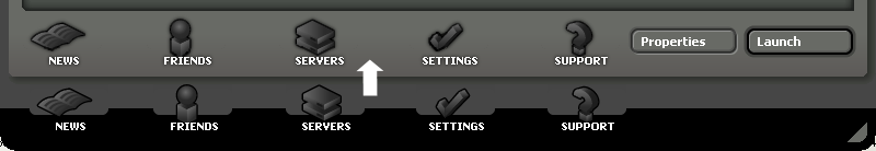
- The icons at the bottom of the expanded window don't visually "fit" with the existing Steam iconography, but if this is the start of a new style, I welcome it (they are attractive). -- Lunchtimemama
- I'm not to keen on the large black area on the bottom of the main window where the News, Friends, Servers, Settings, and support icons are. On each tab page there is ample space for them just above. Here is an example: icons.png Will
- Personally, I don't much like the icons, but that's mainly because they're duplicating menu functions. The UI would be more functional without them, but the tradeoff is less appeal to those who like the eye-candy.
Functionality
Skinning
Store
Expanded Games List
Mini Games List
Menu Bar
- I haven't made up my mind on the menu bar just yet, but here is an argument for its removal:
- 1) Since "mini" implies a small, bare-bones interface, the menu bar could logically be removed from the mini games list.
- 2) Left only with "full view," the View menu simply duplicates the buttons and tabs of the window, so it is entirely redundant.
- They will become useful to people who can't use a mouse if and when Alt+* keyboard access is added. --TomEdwards 11:59, 10 Oct 2005 (PDT)
- 3) The Games menu only has one item: kinda silly if you ask me.
- 4) The "Technical support page" link in the Help menu duplicates the Support icon at the bottom of the window. To remove the redundant "Technical support page" link from the Help menu would leave us with another one-item menu.
- 5) The "Settings" link in the File menu duplicates the Settings icon at the bottom of the window.
- 6) Removing the redundant View menu and the one-option Games and Help menus, we are left only with a three-item File menu. With a menu bar this sparse, why have one at all?
- Even if one were not to eliminate the View menu and were to keep the menu bar in the mini games list, the "Technical support page" link in the Help menu still duplicates the "Support" link in View. This renders Help a one-item menu along with Games. The inclusion of a menu bar, of whose menus half have only one item, should be questioned.
- -- Lunchtimemama
Inline Games Update Status
New Properties Window
- Very nice new properties window. I especially like the Verify Cache button and properties for mods! --Lunchtimemama