Skybox Optimization
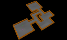
This article discusses the different methods of how skybox brushes can be placed in a map, as well as their advantages and disadvantages. For this purpose, an example of a map is given on which all methods are applied. Roof brushes are hidden for tutorial purposes.
This article applies especially to ![]() GoldSrc and
GoldSrc and ![]() Source, where maps must not have any leaks and where skybox brushes are needed to view any skybox. Since
Source, where maps must not have any leaks and where skybox brushes are needed to view any skybox. Since ![]() Source 2, these requirements no longer hold.[Clarify]
Source 2, these requirements no longer hold.[Clarify]
Overview
| Method | Description | Advantages | Disadvantages | |
|---|---|---|---|---|
| Box Method ("Diaper Method") |

|
Create a huge hollow skybox block that contains the entire level |
|
|
| Tight Skybox | 
|
Create skybox walls and ceilings room by room without creating unintended walkable areas |
|
|
| Dynamic approach | 
|
Like Tight Skybox but not that tight, leaving the different sections of the map connected above the playable area |
|
|
Some more benefits of creating a proper map-optimizing skybox can include:
- Easier use of areaportals
- Easier organisation of
env_soundscapetriggers - Rendering of larger numbers of detail props on displacements
Box Method
Most inexperienced mappers tend to create a large box around their level and texture it with the tools/toolsskybox texture, then carve it outwards to create a literal 'skybox'. Most mappers do this because they are not experienced with how a skybox works and its effects, or could do this simply because they do not want any leaks in their map. This is sometimes referred to as a "diaper" skybox.
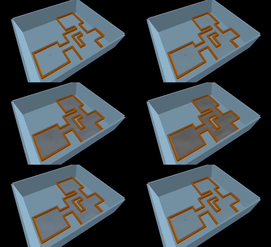
Either way, this "Box Method" is not the way you should form your skybox, as it can cause more issues than it solves. To demonstrate why, a small map will be created for the purpose of this article. It's a simple layout: a few paths with three large areas and walls separating them all. This isn't the most complicated map but it serves to illustrate the point nonetheless. Also, notice how the ground throughout the level is made from displacements sewn together. This is quite common, and you will see how this affects the skybox and map optimization in a moment. With the "Box Method" applied, the map would appear like the image below.
The displacements are fading in and out for a reason; to demonstrate that they are not actually taken into account by VVIS. Displacements do not block visibility and VVIS will not calculate visleafs that stop at the surface of displacements; the visleafs will go straight through them. If you had a wall made of displacements, your computer would still render all the models, players and geometry behind them. Only the world geometry - in this case the walls/brushes - will block visibility and create the visleafs that control the items to be rendered.
In
In
Tight Skybox
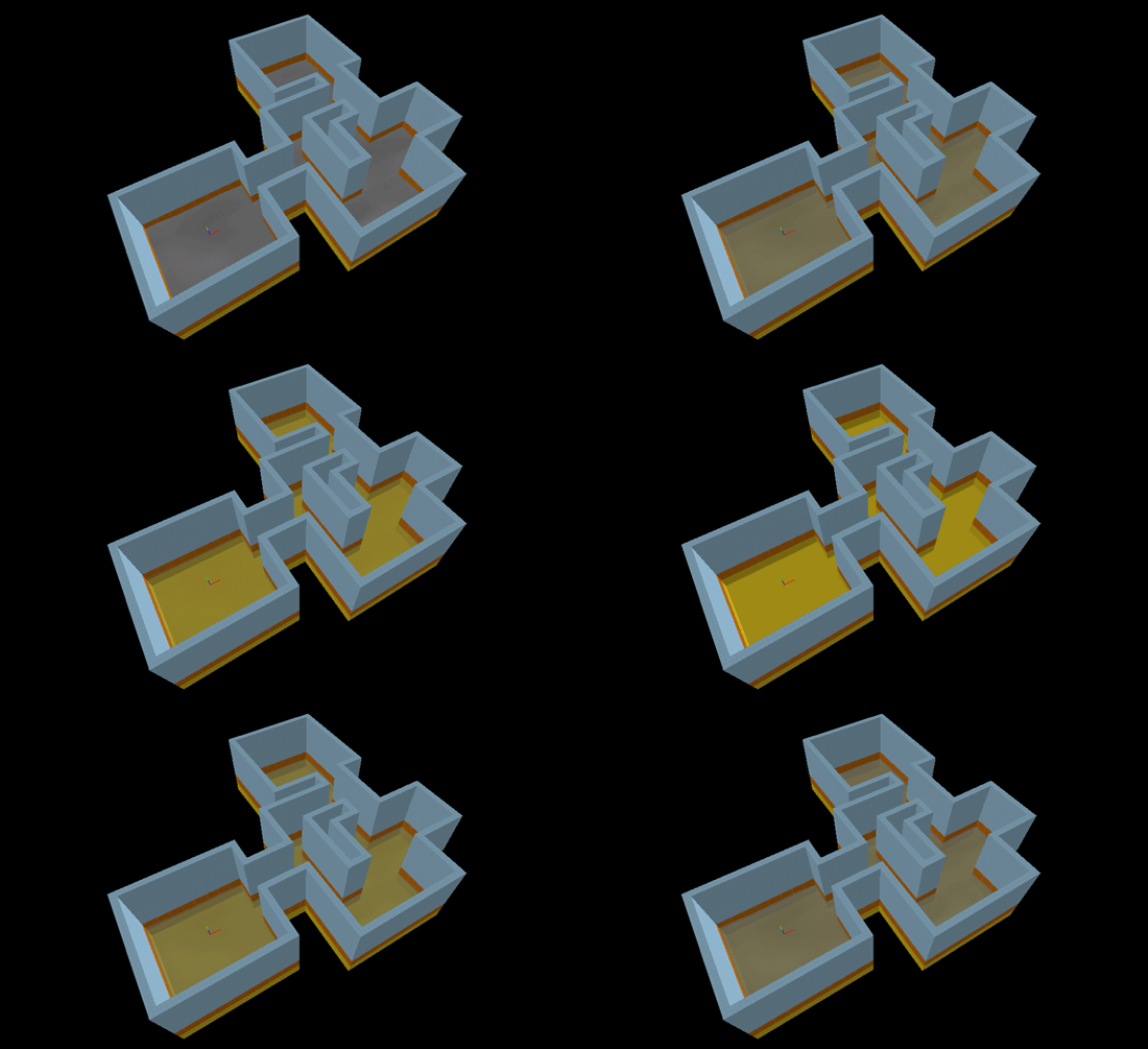
An example of a properly created skybox is as follows:
The skybox now conforms with the outline of the level, and the nodraw texture is used in all areas underneath the walls and floor, instead of the tools/toolsskybox texture. This reduces the amount of calculations needed (lowering your compile times significantly) because the skybox doesn't contain all that empty space generated by the previous method. The nodraw texture is used because we don't need to create light beneath the level, and we don't want rendering errors that will occur when light hits the displacements from below.
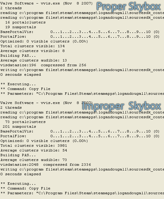
All these methods make for noticeable changes to the compile:
Portal Clusters: 73 »» 16
Numportals: 201 »» 19
Total Clusters Visible: 3981 »» 134
Average Clusters Visible: 54 »» 8
Average Clusters Audible: 73 »» 13
VisDataSize: 2048 »» 196
For such a small map, these differences are already enormous, and will dramatically increase the performance of the map in-game, especially if the map was larger.
When Not To Build Sections
Conforming the skybox to the paths of your level shouldn't be done all the time, but only where appropriate. There are a few cases where you should leave gaps to see through, so you can view the next section of the map, for example.
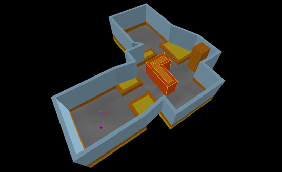
A tall orange 'tower' has been placed in the middle area of the map, as can be seen below. However, if the skybox remains as it is then that tower will appear/disappear when people walk around due to the construction of the skybox. Trimming down the skybox in places is required to make sure that the tower is visible from all angles that the player is able to see it from.
By removing and trimming walls so that the tower can be seen from any angle, and by using the nodraw texture between the walls in the center, we end up with a result similar to this:
One can also try to limit the area in which the tower will be rendered. Simply raise the height of some walls, so that when the player is near a wall and the tower is behind it, the tower cannot be seen due to the wall's height:
See also
Category:Optimization (Level Design) Category:Level_Design_FAQ
