Color Theory in Level Design
| Abstract Mapping series Discuss your thoughts - Help us develop the articles or ideas you want |
|---|
|
Ammunition | List of HL2 Animals and Creatures | Mapping with Antlions | Beams and Lasers | Cables and Ropes | Moving Clouds | Color Theory in Level Design | Combat | Combine | Compression (Source 1) | Doors | Dust, Fog, & Smoke | Elevators | Level Transitions | Environmental Lighting, Sun, Weather, & Outdoors | Explosions | Fire | Half-Life 2 Foliage | Glass & Windows | Headcrab | Health | Ladders | Lighting | Optimization (level design) | Physics | Retinal scanners | Sound and Music | Special effects | Terrain | Trains | Turrets | Water | Weapons | Zombie |
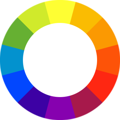
Firstly, a bit on color theory in general: Wikipedia explains how the color wheel is set up to show 12 important colors. 3 primary, 3 secondary (mixing the primary colors), and 6 tertiary colors (created by mixing primary and secondary colors). The primary colors (Yellow, Blue, and Red) form a triangle. The secondary colors (Green, Purple, and Orange) are directly in between the primary colors. These also form an upside-down triangle. The tertiary colors are in between the primary and secondary colors and provide the shades of colors. This is important because of how people perceive color combinations.
Color Perception
Colors next to each other (analogous) blend well, colors directly across (complementary) contrast each other, and colors 1/3 the way around (triadic) help accent. This means if yellow were chosen, then the colors yellowy-green, pale orange, blue, red, and purple can all work with it if used properly. The key comes from the fact that if yellowy-green is chosen to work with the yellow, then using blue becomes tricky, as blue doesn't work cleanly with yellowy-green.
The colors picked define everything about an image. What the viewers feel, where they look, what belongs there, and what they notice the most because they saw it first or last.
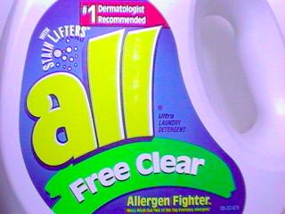
This is a solid example of using complimentary colors to work to a nice visually appealing goal. The colors work together and you can see each color fitting in with the rest. The thing your attention is drawn to are the focus of the image such as the name, slogan, and properties.
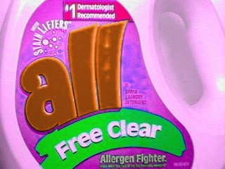
This is another approach to the same bottle, the color palette in its entirety has been shifted, no individual color changed on its own, all colors changed the same amount. It all still fits together proving that an established palette is the key to a solid image.
The first images are easy to look at, but the last image doesn't feel right at all. Taking the colors used as more than colors helps an image feel better to the viewer.
Effect of Color
A color does more than simply define how objects look. Sight is the primary human sense, whatever anyone see affects them deeply and carries more effect than just that of an image. Each color has feelings and meanings attached to it. Take red, for example: it can be a color of passion, romance, danger, warmth, or blood, depending on the context and shade.
When asked to list what red means or feels, this is a pretty standard list. What shade is picked and how it is used in the image can give any feeling or any meaning, but there's preconceptions to deal with like the ones above. Everyone knows a red light means stop, green means working, blinking means busy. When creating a scene if how each color is used in life is ignored, the viewers will misinterpret what they're supposed to see and feel. Every color has an inbuilt meaning and using that meaning is what allows level designers to create an atmosphere in their creations. For example, in Half-Life 2, pale blue lights create a cold feeling in the combine citadel, while warm yellow lights create a comfortable feeling inside the Black Mesa East. Half-Life 2 uses this as a regularly, and every level designer can as well.
The process starts by picking the mood of the area. The mood intended should affect what textures are picked and what lighting colors are used. Take, for example, a creepy swamp scene. Black is a very mysterious and threatening color, so go with darker shades and low brightness values. Greens for algae and swampy water are expected as this is a swamp, so include those into the palette. A hut is needed for this, so checking the color wheel orange is 1/3 round from green and a dark shade gives the color brown. This gives a perfect accent color that fits the mood. Using the brown a wood becomes a good choice for the hut. Now there are key colors, materials and a feeling, by sticking to textures and light that work with the theory of the key colors and moods the scene will make itself.
A nearly ubiquitous rookie mistake is saturation. Most everything in the world isn't a specific color, it's white where one of its wavelengths comes through better. As such, a yellow lamp in theory should be a white lamp with a little bit of yellow added in. Unless you explicitly want to create over-saturation, keep this in mind!
The only thing still missing is a point of focus.
Point of Focus
The point of focus is simply what the designer wants the player to be looking at. Whether its a distraction, the piece of a puzzle, the way out, or even the next enemy its where the player should be looking and going. While creating a true point of focus is beyond this article it can be done by any means including sound, motion, shape, light or color. As this is a color theory article only light and color shall be discussed. The simplest way to give a point focus with color and light is accents and contrasts, a bright light in a dark room, a blue traffic cone in a line of red ones. As stated before contrasts and accents can work well in a scene so its often not hard to include a point of focus. The key becomes making it the right object at the right time.
Going back to the example of the swamp with the hut, the hut shall be made a point of focus. As the palette will be mostly dark colors and light the best way to make the hut stand out is to use bright light. Add a bright light to the hut and it becomes almost instantly a perfect point of focus, an accented color under contrasting brightness. The player will notice the hut and move towards it. Because it's noticeable, it stands out.
However, for a bad point of focus, move to a red brick alleyway. Brick buildings lining both sides, there's an area on the roofs that's out of reach its intended use is where the enemies come from. Adding in a green dumpster and a greyish door the scene is finished. Red and green, contrasting colors, the dumpster fits in the scene. Upon playtesting the scene comes the problem. The player can't get up to the roofs, but the player will notice the dumpster as it's a contrast element. The player tries jumping around on the dumpster for 5 minutes because they think that's how they're supposed to get to the roof. The player hasn't noticed the door because its only a neutral color, it does not contrast or accent.
This is the problem with point of focus in color and light. The wrong thing can be made to seem important if a scene is made carelessly.


