User:Chickenmobile/Map Design
All good maps in a Deathmatch kind of map all have to have flow and style, plus a continuing theme and a kind of uniquness that no other map has. Remember that your map should be entirely your map. Do not use parts from maps that are not your own as that can clash with copyright and ownership. Keep it clean and leave it entirely your own (unless you get permission).
Contents
Designing
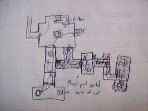
A good map should be thoroughly planned before starting. A simple sketch should be enough to plan out all the doorways, sections and areas that are needed in a map. This should be done on a physical piece of paper. Remember sketch not accurately draw your plan, this is usually done for brainstorming your design rather than designing completely what it should look like. When you got a sketch that you are happy with then start designing more in detail of what you want your map to look like. Usually drawing on a piece of paper is better than on a computer as it is definitely quicker and ideas can easily slip out of a head, it is better to get them quickly down on paper. If you have started thinking about the actual 3D look of your map, if you can sketch it also on a real piece of paper including things like weapons and props. Also think about levels and stairs in your map, not all are flat, but a flat design is definitely easier to design. Different levels make a map interesting and more surprising of where an opponent will come from but too many hiding spots do not make it a very balanced map. So for an example I’m going to make good-designed map and insert the screen shots of the map progression. I will leave the downloadable .bsp of the map in the links below.
Note: Not all information here is true for all map designs, rather I’m telling you the principles of design that make a map ‘look and feel’ good from my opinions as both a map maker and a gamer. These two properties are helpful in creating a map a player would enjoy but there is the problem that you will play the map more than actually making it =S.
Good Designs
I have noticed that all good maps for 1v1 competitions have similar layouts. Just to point it out to you I’m going to describe two.
dm_lockdown is an incredibly popular 1v1 map and just so happens is one of the original maps made by Valve. What makes this map good is the fact that the map ‘flows’ together with all hallways and the rooms connect in some way (except for a few rooms with ammo in them), with a hint of choice in which direction the player wants to go. All weapons are evenly spread about the map and it is definitely one of the most balanced maps around. The two levels and wide hallways also are good for ‘speed-skaters’ and ‘bunny-hoppers’ that make use of corners and ledge jumps.
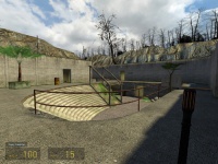
dm_lostarena is a map that has curved walls connecting together a series of buildings and hallways. Its look and feel is greatly positive as the colours are that used are warm and the curves of each of the walls give it a natural and friendly feel. It is definitely easy to navigate and through mild use of props and things like teleporters and a jump platform. This map again has 2 levels (surprise there) and almost every room and hallway is connected to 2-3 pathways.
Well from the conclusion of my research (2 maps =D), it is fair to say that a good balanced map has:
- Subtle props
- 2 levels (or storeys)
- Main areas with wide hallways linking them together
- Consistency in texture, theme and structure
- Choice of where to go, although not too many choices (usually 2-3 entrances or exits)
- A range of different weapons scattered about the map
- Sound
A Few Tips in Designing
- Never put something in that is too unrealistic. A floating block with no supports can acquire interest from a player but then becomes annoying or just weird. If you map has the theme of a ‘killbox’ it does not matter as much but it is still better to join blocks or brushes to keep a flow in a map as no flow just creates chaos.
- If you are creating a realistic map like that of lockdown or other similar maps, be sure to keep it to a theme, or keep rooms and hallways similar in design. If the map changes too much it may become confusing for the players when travelling in the map. Wouldn’t you be creeped out if a jungle led into a casino? The two do not match at all and although it can be amusing, it is not a good mapping technique. Also keeping your map in similar design means that you can reuse bits of your maps for other parts. Like a doorway can be reused elsewhere and there is no need to look for new textures, reducing the time creating the map and also reducing the size of the finished map file.
- Keep the map interesting. The pure design of a map is usually not enough. Textures, props and a soundscape contribute to the atmosphere of a map. Do not go overboard with things though, it is not about enjoying the atmosphere rather it is a mix between good and fair combat and good design. Avoid ragdolls, too many overlays (like graffiti) and props that just get in the way.
- Never put a room with a dead-end unless it has something important in it like a good weapon or something worth getting (like a super armour charger or lots of health packs). You will find that your efforts of making that room in the first place would be wasted because no one would want to go there.
- Always put a light source in somewhere like a large glass roof or windows, a dark map is not necessarily an attractive one.
- Put something like a trademark in your map. For example in all the default Valve maps:
- Lockdown - the fan room and the amount of explosive barrels
- Runoff - the nuke
- Overwatch - the rocket
- Steamlab - the explosive steam
- Underpass - the navigation of going underground and above ground, and lastly,
- Powerhouse - the knowing that you are going to intercept someone sometime with its crazy assortment of rooms.
My Good-Design Map Example
After looking long and hard at how to make a wiki I found out how to upload images and creating simple headings and other cool things, I will only take screen shots of the design not the actual entities and others that I am going to create, and explain throughout the making why I placed things where.
Starting off
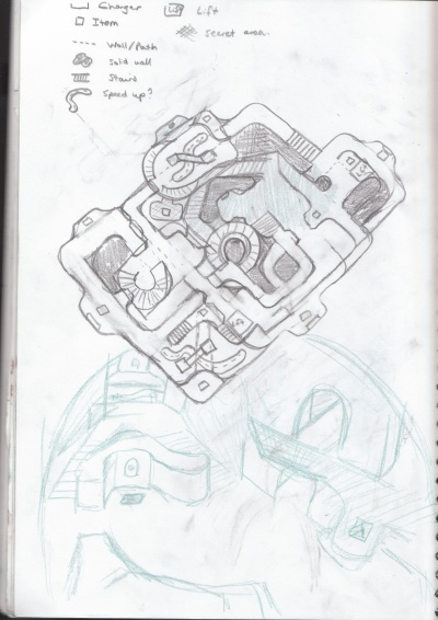
I made my sketch and after basing it a lot on lostarena I decided that it would be a bit of a tribute of how much I really like this map. I also made a simple 3D sketch as an example in green pencil (no I am not the best 3D drawer in the world) but ths definitely helped me of the visual component of making a map.
From the research before, it also helped me of how I wanted the map to look like and I quickly jotted any ideas that came to me (in a brainstorm) on a different peice of paper. No I'm not going to upload a picture but rather I'm going to tell you what I put on that peice of paper.
- Curved
- Chargers
- Two levels
- Hanging trees and a cubby house
- Cool distant objects (namely warehouses, smiley cactuses!)
- Custom textures?
- Speed ups
- Cool jumps
- Secret holes in walls (weapons?)
- Areas only accessible by strafe jumping
- My logo :P
- Flooding?
- Shoot through platforms on top level
- Secret underwater tunnel
- Cookies.. mmm.
Now that I have totally got what I wanted and a few ideas of what I'm going to put in it Im going to go into hammer and start creating my map!
Creating Map in Hammer
Just to be clear to you all, I usually start a map with a hollowed box and work around in box, since this map is almost rectangular I am going to do the same but edit the regions of where the skybox is later. Putting a giant skybox around the map may get all the VVIS the Vrad to work but it makes the map have too many portal areas and increases the map size in the end.
Stage 1
Now to get to work...
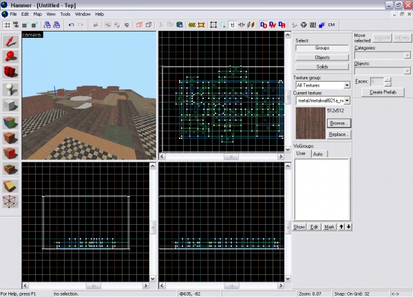
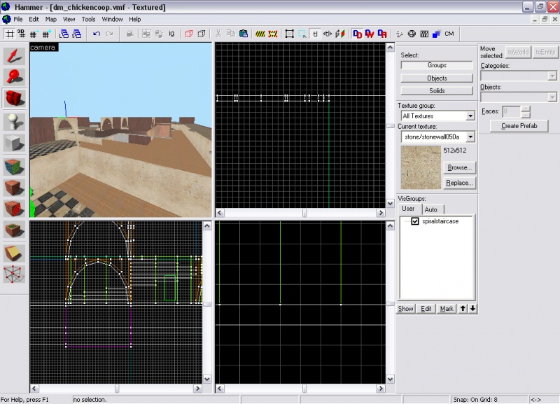
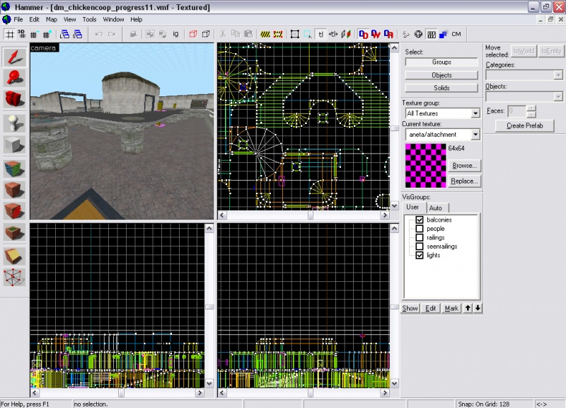
Here is the start of my map, this took around an hour to do but it is more than what you just see there. I put the whole of the map in a kind of Grid-layout that maps out where all the hallways and walkways are. I used only a couple of textures I found randomly but I still texture accordingly, I am just going to use the "replace" tool in the texture overlay to cover up the textures I used to better ones when I get more progress.
Tip: When making the absolute beginning and template of your map, never go to a fine grid. It is easier to work around blocks that are measured exactly to a larger grid size then work down the grid sizes until you reach the finest details. The smallest grid size I used for the start was 8-units, and that was the floors.
The reason why I made it in a grid layout is that walkways could simply be copied and pasted and everything literally matches up. The walkways are facing opposite to other walkways, and just to complete flow of the map I added a few more walkways underneath the top walkways.
Well what you know, here I've added walls and simple doorways, I think the doors do look a bit tacky but it will do for now. No props or other complex details have been added, yet. Now is all about creating the main layout of the map and working in the details (as I said before). I made the spiral staircase out of an arch and put simple connectors between the pathways which I want people to jump over.
Stage 2
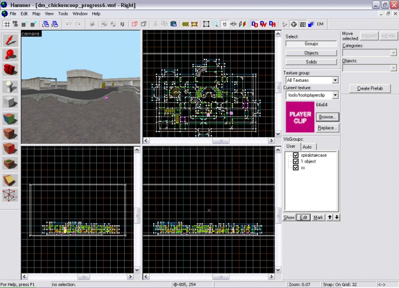
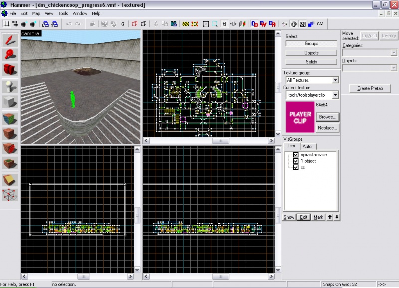
Just to tell you the truth, I actually did a lot in between these two screen shots and had to recover and old auto save from the AutoSave folder ;). But nothing that is too much. Although it looks almost completely different I only actually curved the walls, added a few more walls and walkways and changed the textures. (High influence from lostArena). I still didn't put any models (other than ladders) but I did put more detail for my lifts and put a bit of water in a place that I wanted water. Also i carved holes in the walkways and put ladders where I thought they would be in a good place.
Why curve it? It gives it a natural feel, the less of square edges and clean-cut corners, the less it will feel unnatural and out-of-place. It also as I suggested before, gives flow, a hard thing to create when making a map. Yes my map may feel unrealistic at the moment. But connections like doors behind unreachable places, props , things beyond and in the 3D Skybox,sounds beyond walls and doors give an idea to the player that there is more to the map than there actually is rather being in an enclosed space with no other connections to the world it is in. I am going to eventually add these things in during the main course of the map and the ending of the making of the map.
Here are a few more screenshots of the map-making at this level.
Stage 3
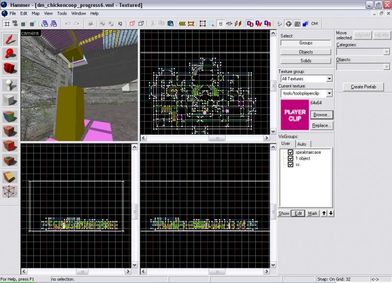
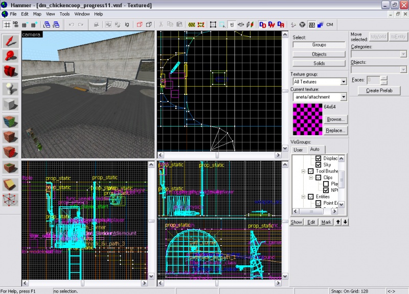
Now that I definitely have the main layout and textures of my map it is time to put more details in, the kind that are interesting and contribute to the 'feel of the map'. So far I have nothing really to hide behind so im thinking of putting posts up that not only are places to hide behind but hold up the top level (the one with the grate texture above the ladder seen before). No I am not changing the layout of my map, that is already done but I am changing the look and the way it flows.
The way that I have designed it is that I wanted to place weapons into the indents in the walls, but I also need a kind of platform indicating that a special weapon is there. Ive made one and put what weapons I wanted on top. In the image below you can see a shotgun on a pole and a health charger in the distance. The only props here I am placing are that or the actual gameplay. No props to make it look pretty yet. Just so happens that from the brainstorm I had before I did place a spot where you can only gain access by strafe jumping, the reward is 4 packs of armour, armor and health chargers and 2 healthkits (a worthy cause).
You may of guessed it but stage 3 is all about placing props that contribute to the game-play of the map. This would include simple lights, extra walls (like my poles) and things like weapons, health and armour and railings. Remember to place them in spots that would not obstruct pathways and flow and also do not place too much, otherwise it can be confusing and time consuming for you to make. I also fixed up the roofs of the covered areas. I also thought about the trademark I wanted to put in my map. I put a flooded area for the rocket (that resets every 5 mintues). Now just to say to you I know a bit of scripting and I'm going to implement that into my map. I want the characters to run around as characters from Half-Life 2. If this could work it would be the first one I know of.
Stage 4
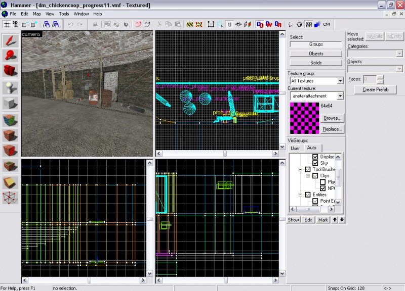
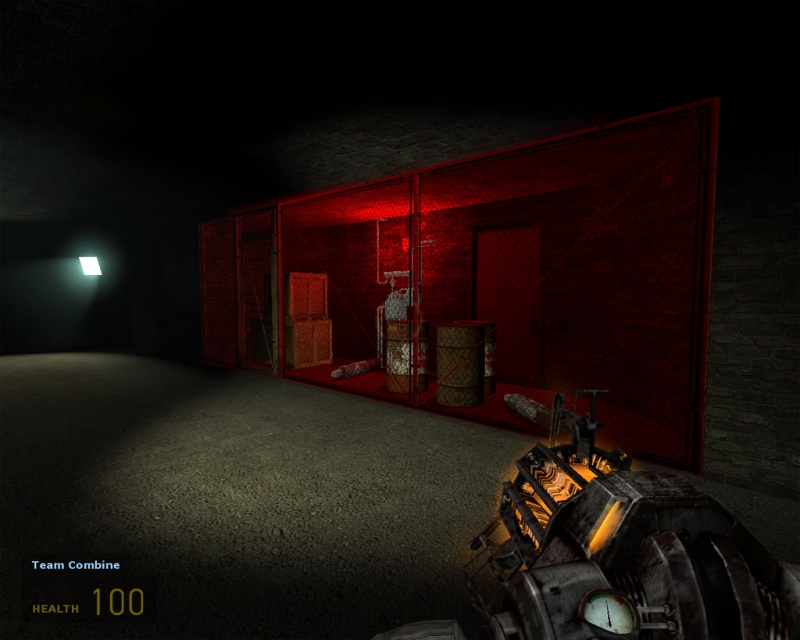
Now this is the part that becomes a little more complex and more into detail. This is where props (from the hl2 engine) are added to make the map look prettier, not necessarily to add onto the map. Usually props are added so then the player can associate with different parts of the map, a map that has places that look exactly the same is not only monotonous and boring but there is no differentiating between different one place to the other. In a game you might notice you have different names for different places of the map (e.g. "The place with the big tree" or "Big charger"). I'm going to make different parts of the map have uniqueness. Rather than showing just in hammer im going to show you both in game and in the hammer editor.
So you see that the finished product is definitely different to that of what it looks like in hammer. Props do add to the feel but try not to make to many props where you can actually touch them in the game. Put them in unreachable places if you must and the only propls you should put in is railings, pipes and occasionaly fences, tables, and shelves. As you see here I've put power poles and lines in and occasional fences and trees.
Stage 5
After you have decided what props you want in your map it is time to fiddle with the lighting. Note: this usually takes a long time to get the lighting that you prefer as it takes a while to compile but this depends on how big your map is and how many lights you put in. Usually I just copy a sun from another map I've made with good lighting and ambient, but it can change for what kind of map you have and what kind of weather it has. For example: If i want a map that is set in the sunset the sun colour would be more red and darker than a normal sun as for the middle of the day. Also the ambient would be lower because the day would be darker. But just to say, my sun is going to be a light orange-red colour and the ambient is going to be a darkish blue-grey colour with brightness about 300. Mostly all ambients are this colour because shadows are usually this colour.
